How to Maximize your Brand with Minimalist Design

Picture this: you’re standing in the frozen food aisle of a supermarket, scanning the shelves for strawberry sorbet. Every centimeter of space is filled with big, colorful, flashy packaging, each fighting for your attention. It’s pretty overwhelming. But then, something pops out among the chaos – a bucket featuring nothing but “SORBET” in cap letters and an image of a strawberry under it. You slide the freezer door open and pick it up – you found just what you wanted!

More than just a trend, minimalist packaging design is a strategic choice.

That’s the power of minimalist packaging design. No unlimited colour palettes, no intricate typographies, no elaborate graphics – just a clean, simple design that focuses on the essential. More than just a trend, minimalist packaging design is a strategic choice that can help brand owners cut through the clutter, connect with their target audiences, and lay the groundwork for a solid brand identity.

Clarity

When products follow the minimalist design route, it’s easier to understand what they’re about. Health food brands have been particularly keen on it. Like this brand of protein bars, who made their ingredients the key component of their packaging artwork. With this design, they can let their consumers know how simple, authentic, and healthy their products are.

Quality

With their effective use of white/empty space, minimalist packaging design can help products look more sophisticated – a useful trick for high-end brands. Think of Nespresso. While other coffee brands opt for big, bold, colourful, and conspicuous imagery, Nespresso’s coffee boxes are the epitome of sobriety: a small logo centred in a big empty black background with a subtle touch of colour. By consistently applying this sleek, balanced approach across all their product lines, Nespresso affirms the premium quality taste they’re known for.

Eco-friendly

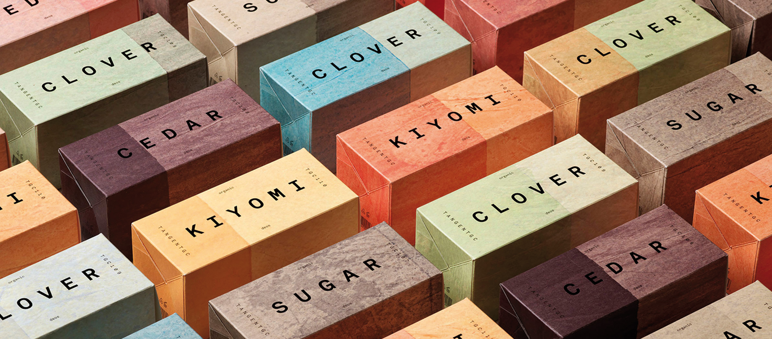
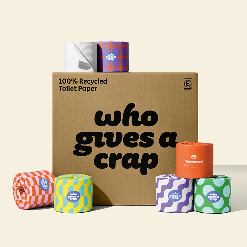
Minimalist packaging design often uses sustainable materials like recycled paper, cardboard, or glass. This can appeal to people who care about the environment. Take the Honest Company: their simple yet elegant packaging has contributed to the company’s reputation as a leader in eco-friendly consumer goods.

Efficiency

Minimalist design means getting rid of all the extra stuff and focusing on what’s really important. This can make the product look stronger, bolder, and more efficient. A great example is Victorinox, the maker of the iconic Swiss Army Knife. Featuring nothing but the company logo, their packaging is elegant and understated, conveying the competence and durability the brand is known for.

Although minimalist design can be deceptively straightforward, it needs a high level of skill to determine the design elements that are essential to communicate the right brand message. Contact us today and let’s talk about your next packaging design strategy.

Text credits: ARD / agi

Images credits: Tangentgc / Honest Company

Let’s talk about your next packaging design strategy.
Get in touch!

Get in touch!