Revamp of a consumer favourite brand
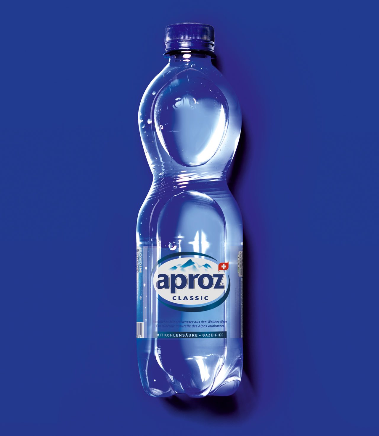
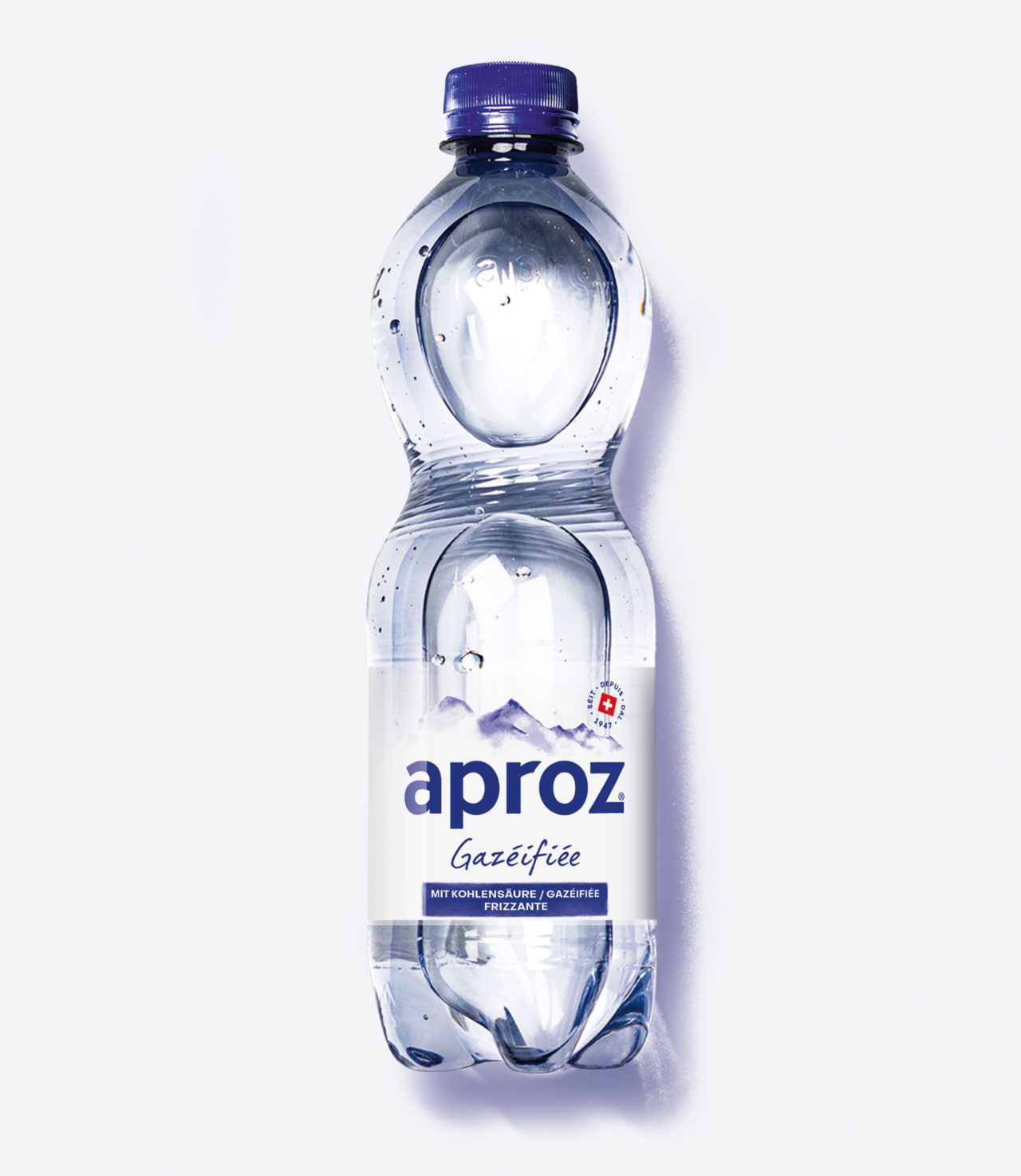
Unveiling and sharpening the brand’s essence for this iconic Swiss brand was our mission. It all started with a creative workshop, progressively moving from concept boards to a clear, singular and powerful identity later applied to the packaging label and communication.
Branding first
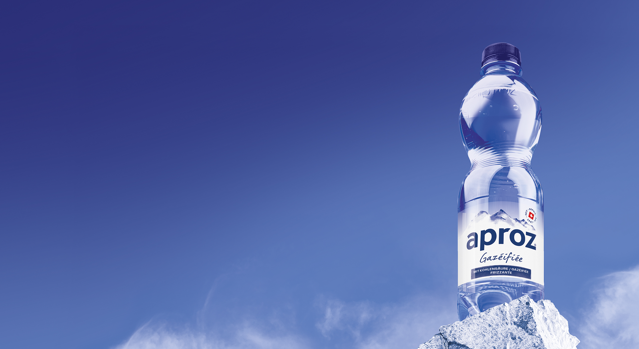
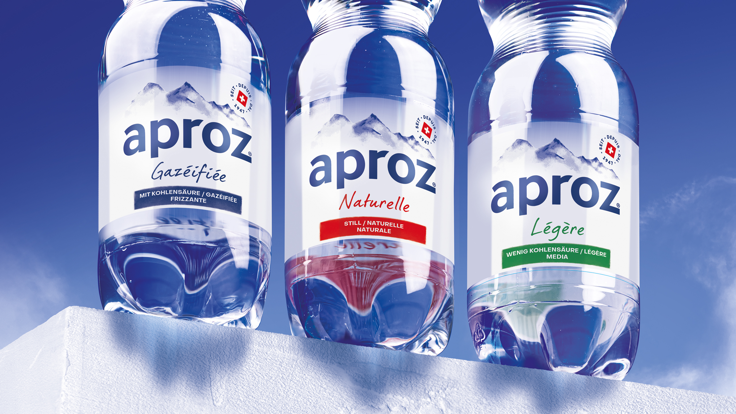
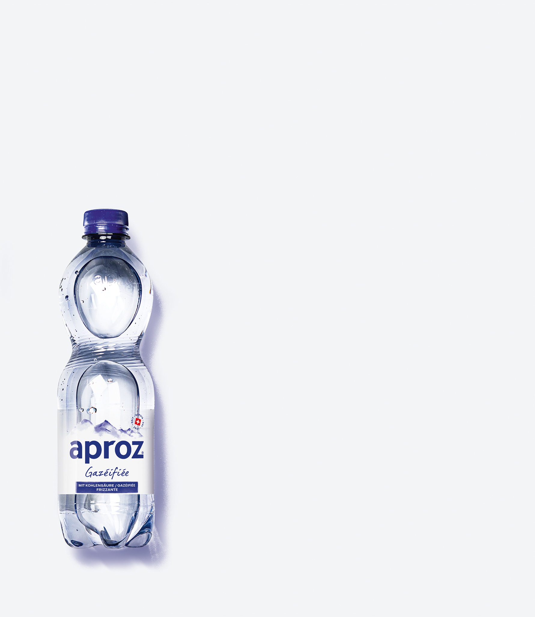
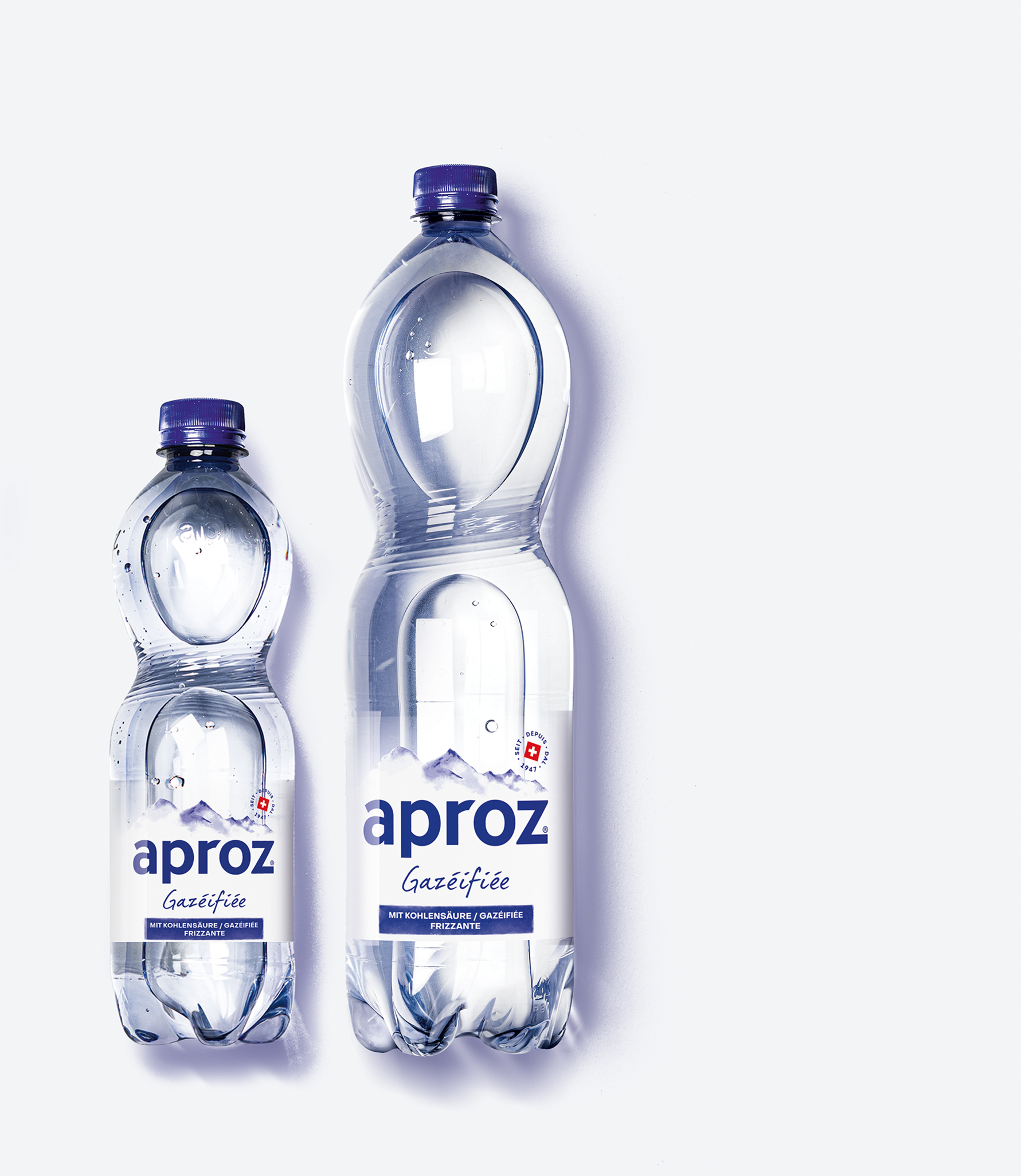
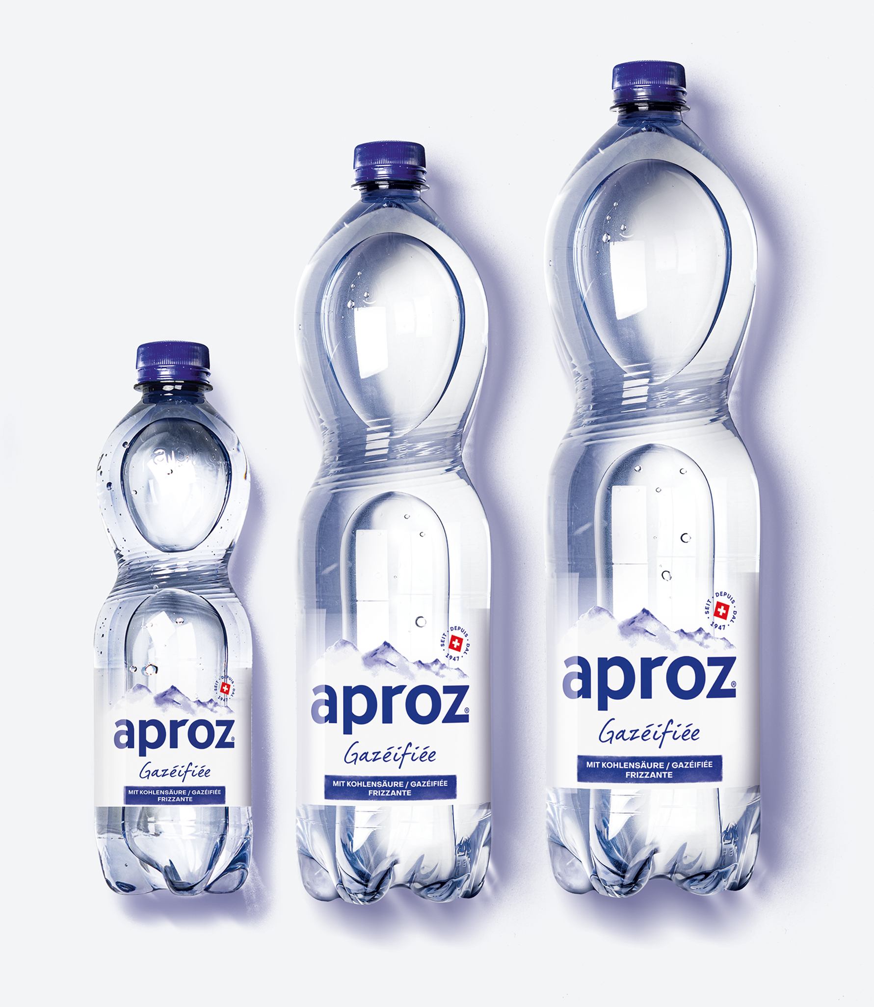
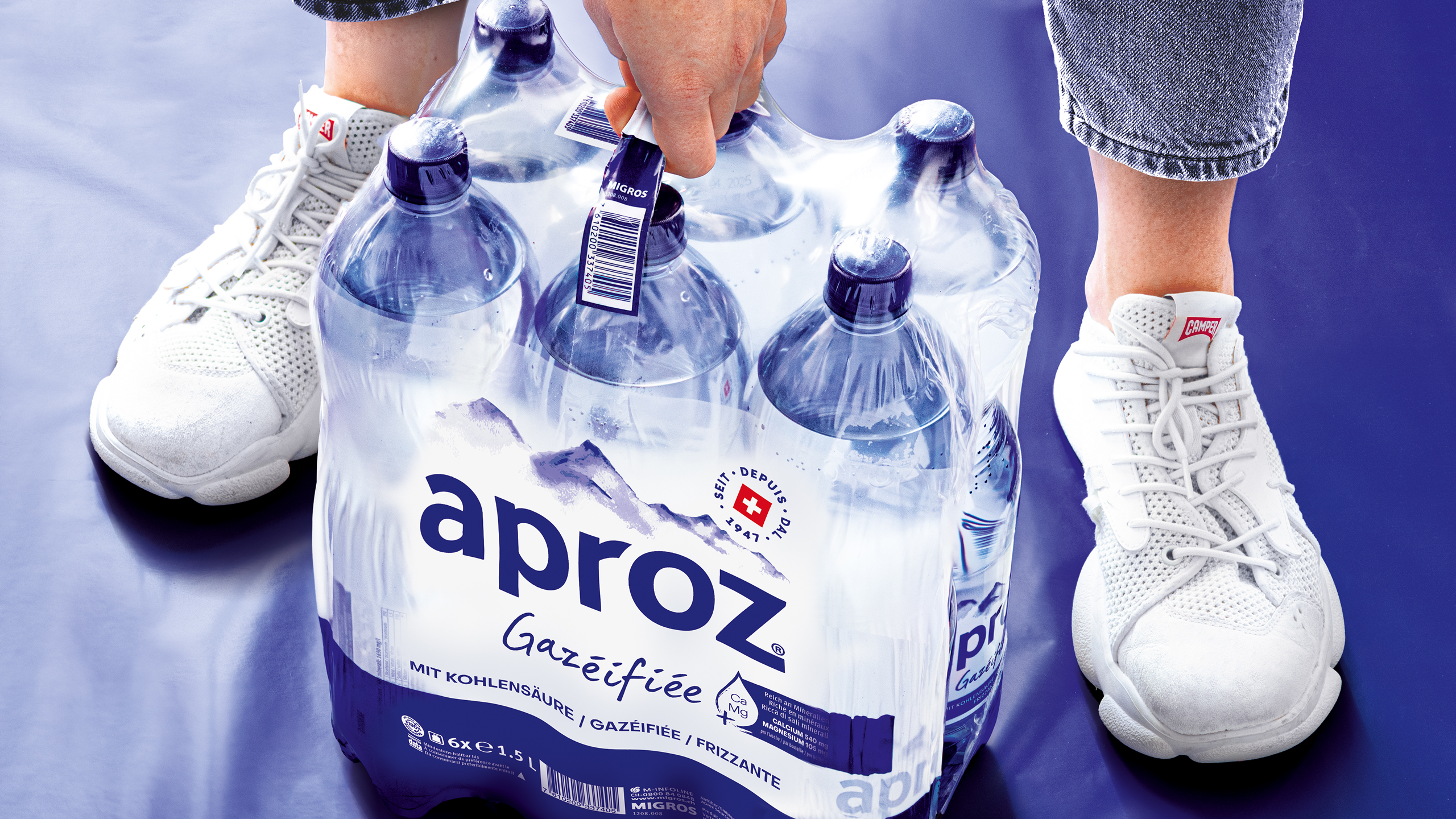
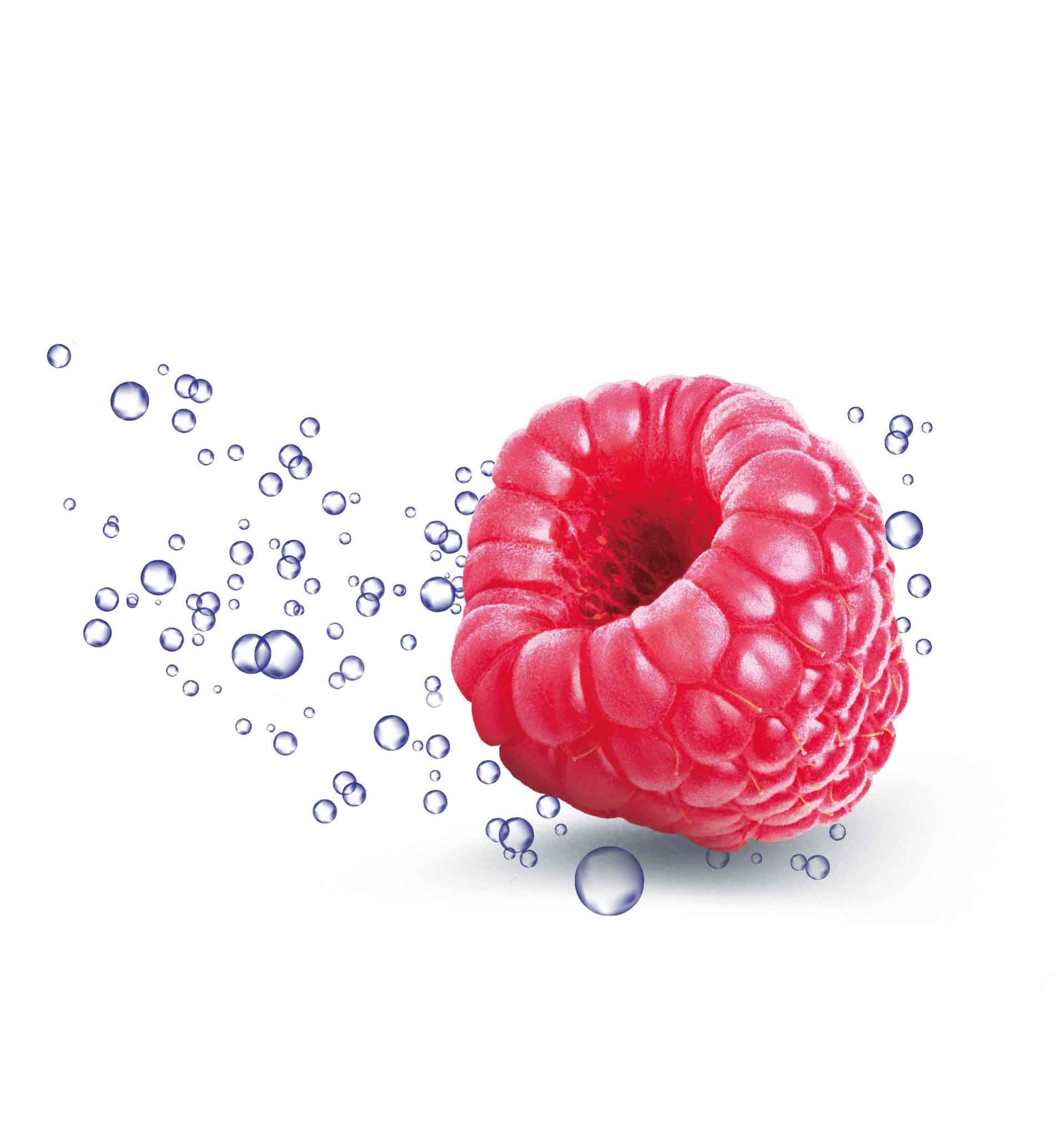
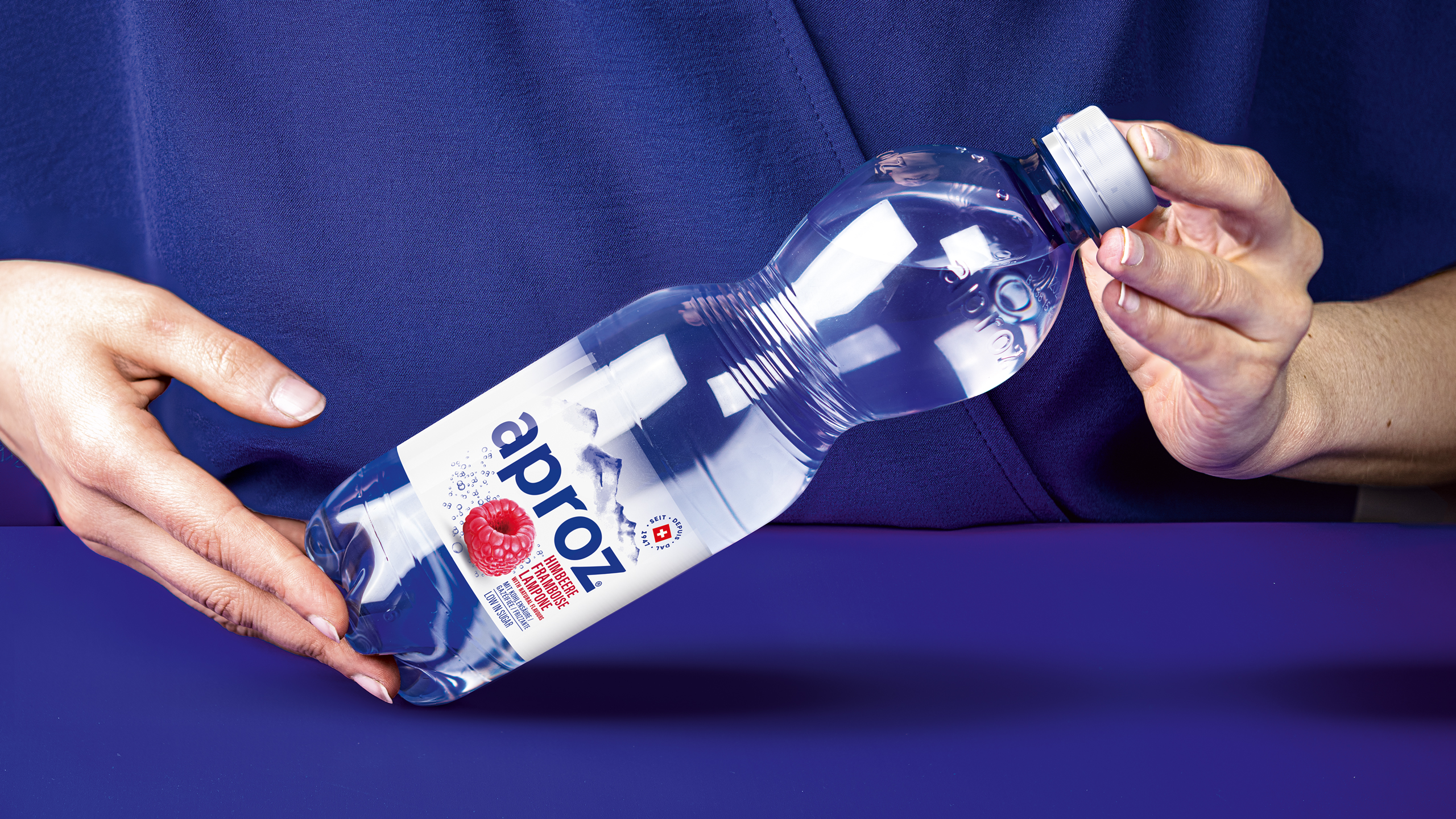
One of our challenges was to make the carbonation level instantly visible while giving the main stage to the brand. This subtle balance was maintained throughout the entire portfolio, from the on-the-go formats up to the retail sales unit.






Trendy fruitiness versus refreshment
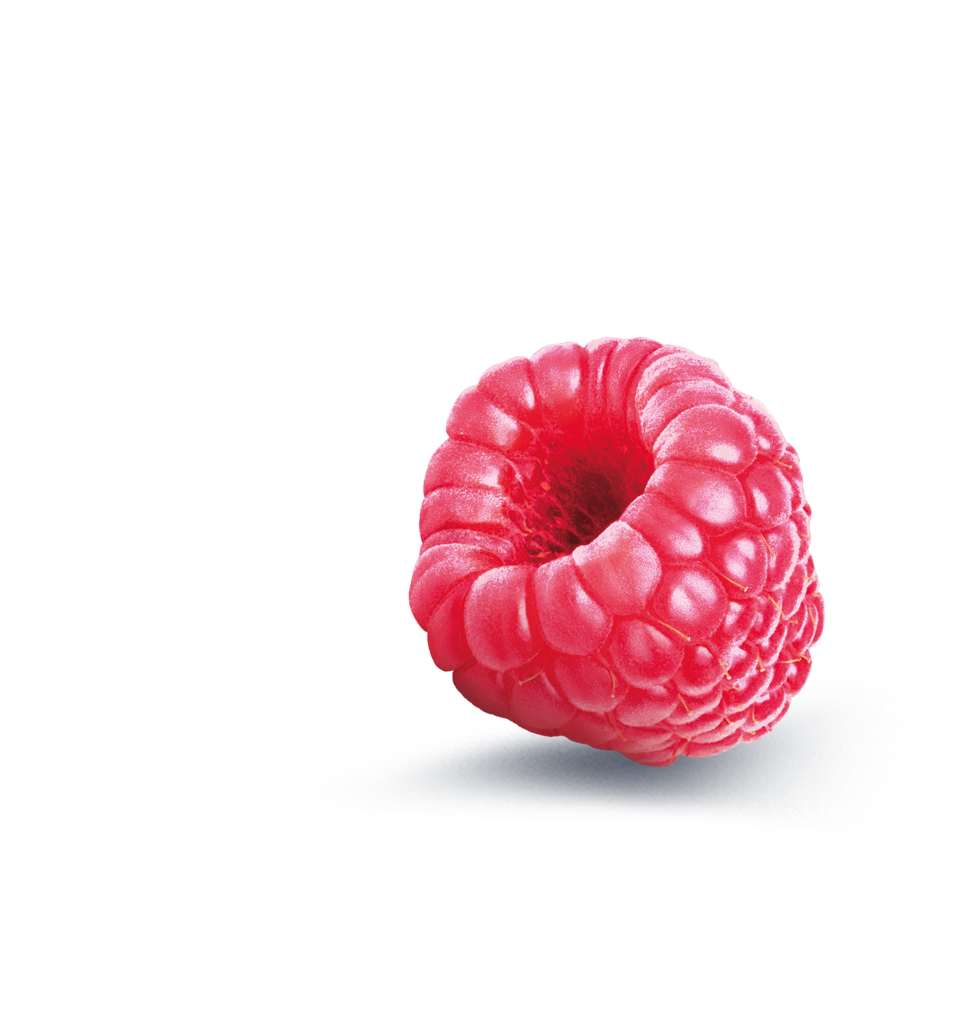
How to streamline and update Aproz’s large portfolio played an important role in the redesign strategy. One of our mission was to find the right balance between communicating taste and staying a refreshing mineral water drink.

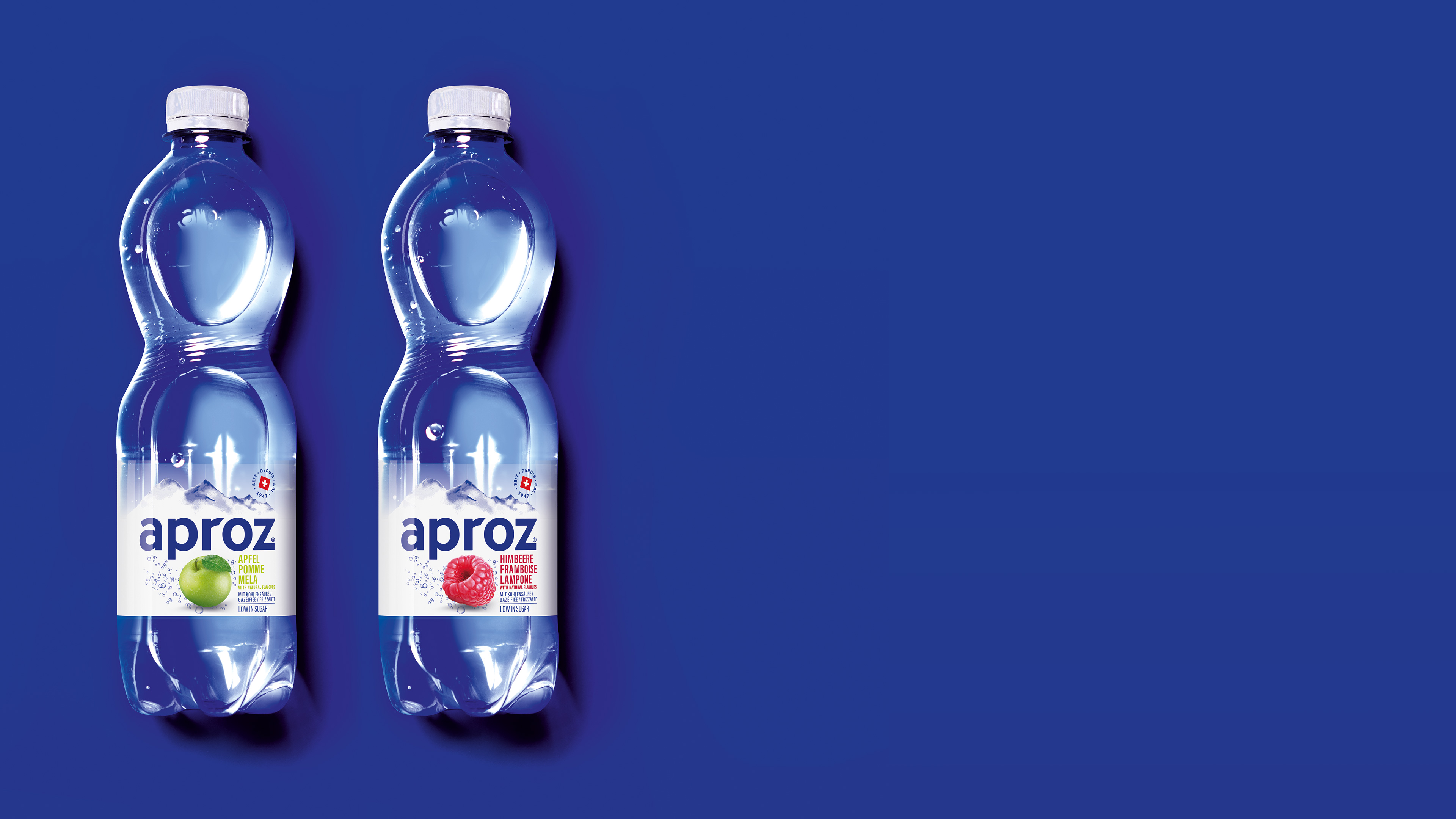
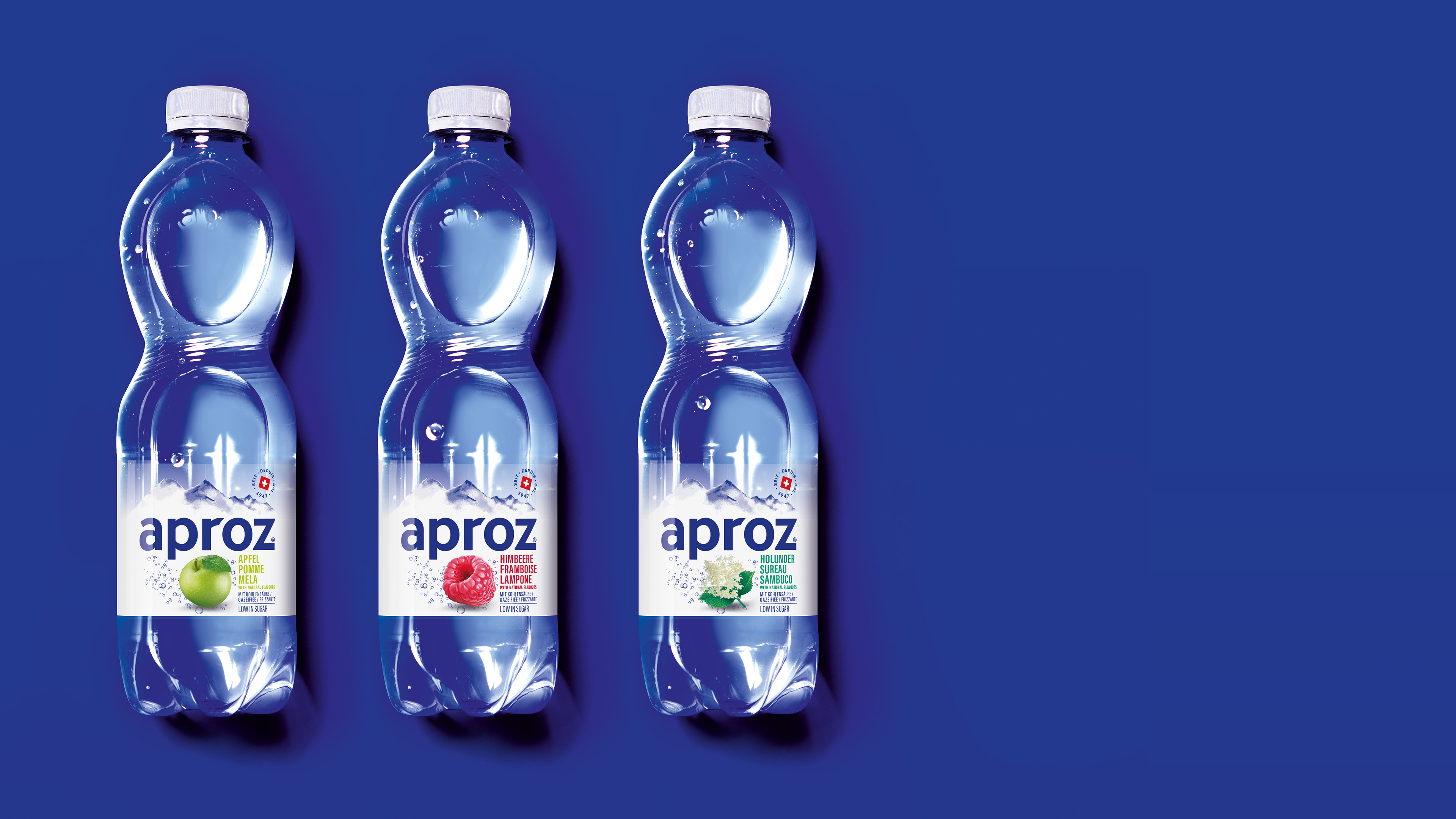
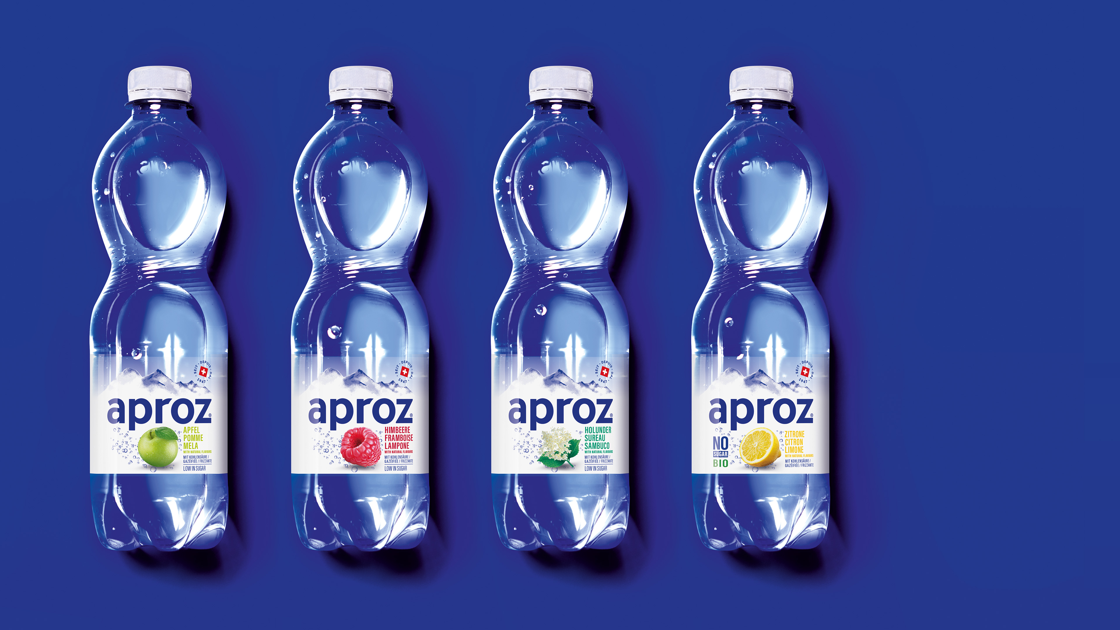
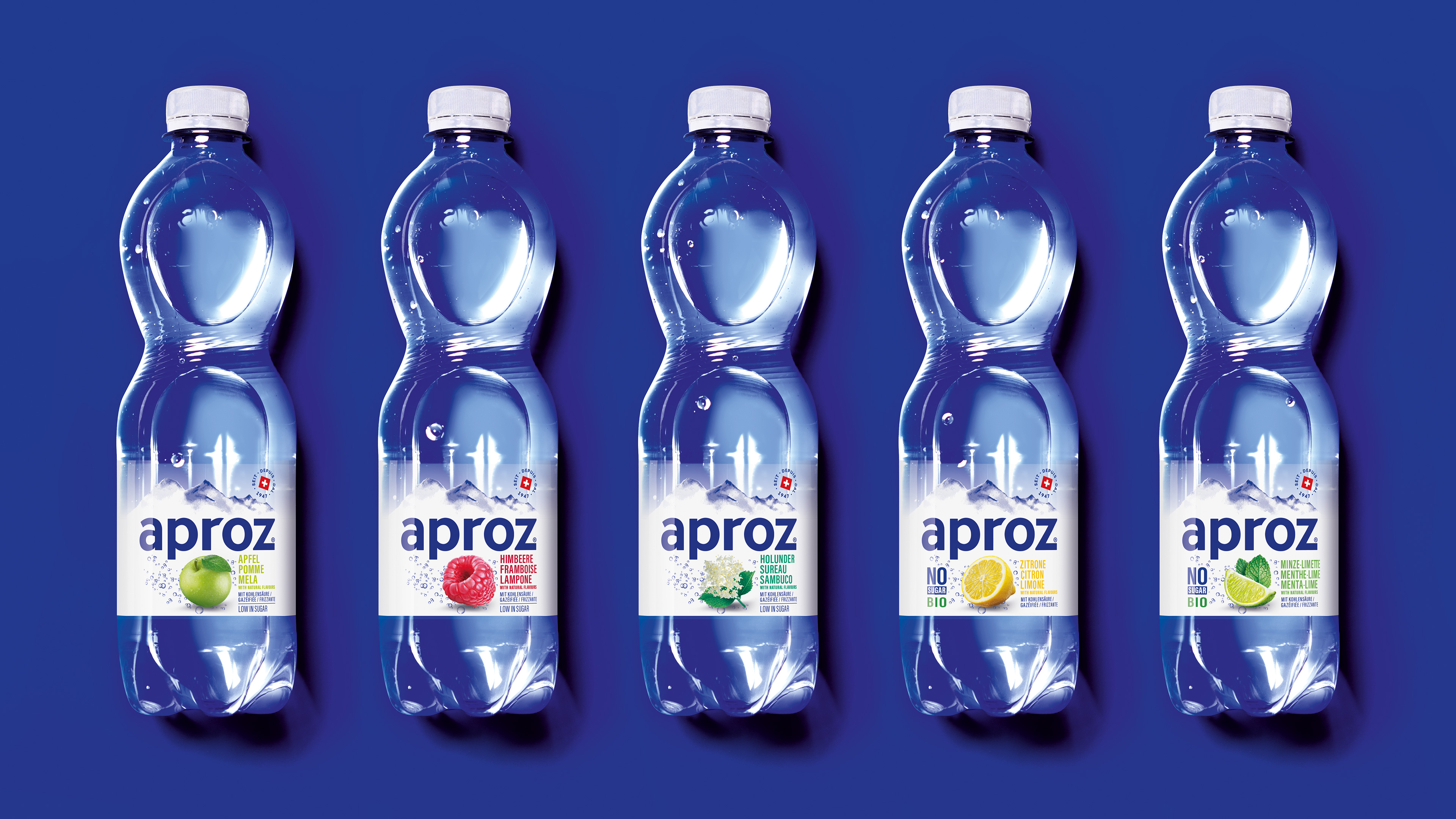
Bold and versatile
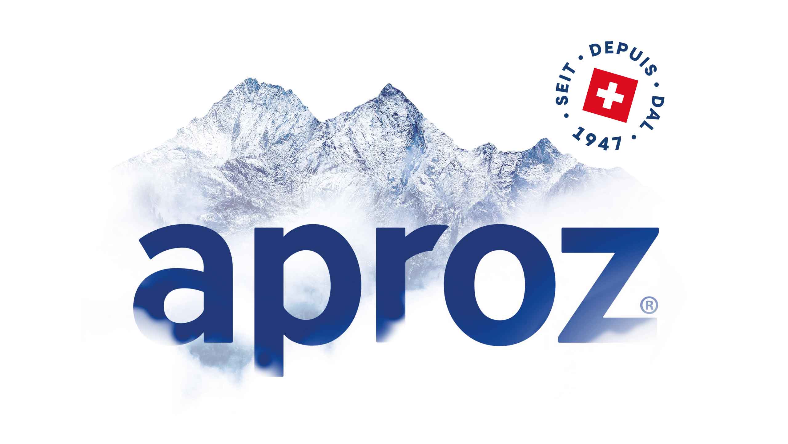
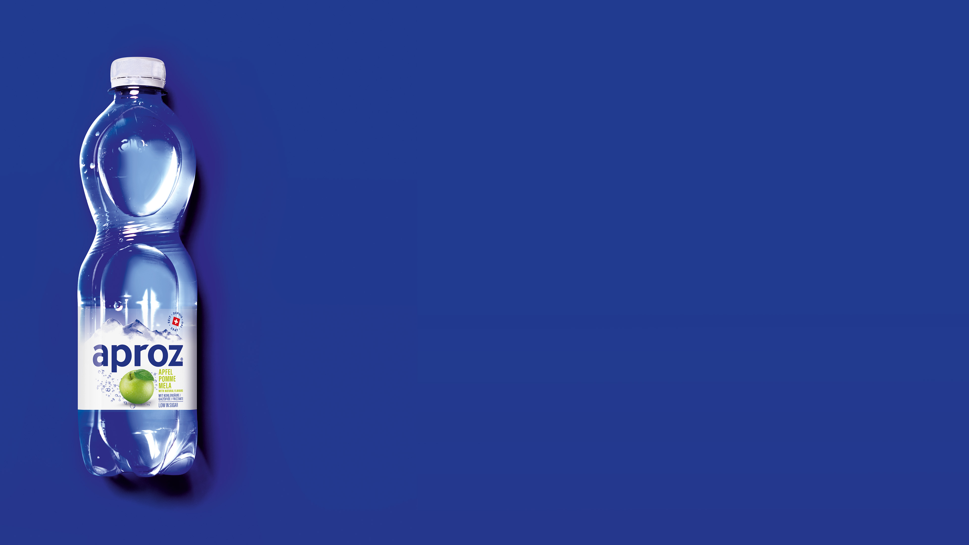
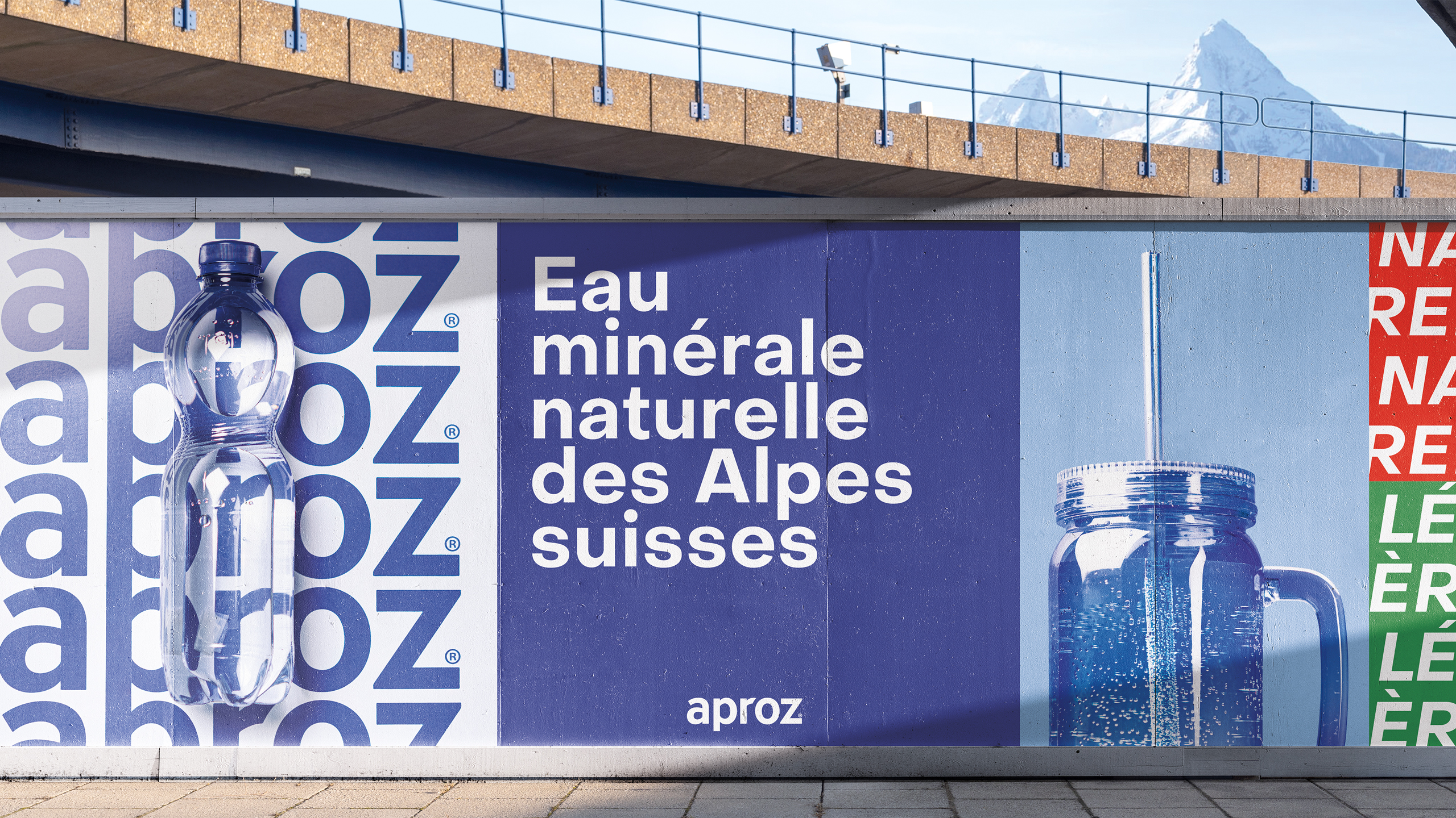
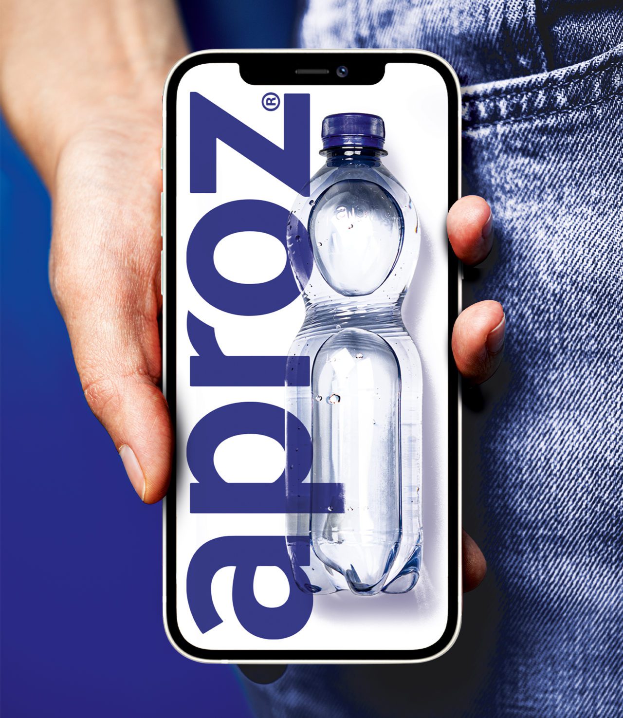
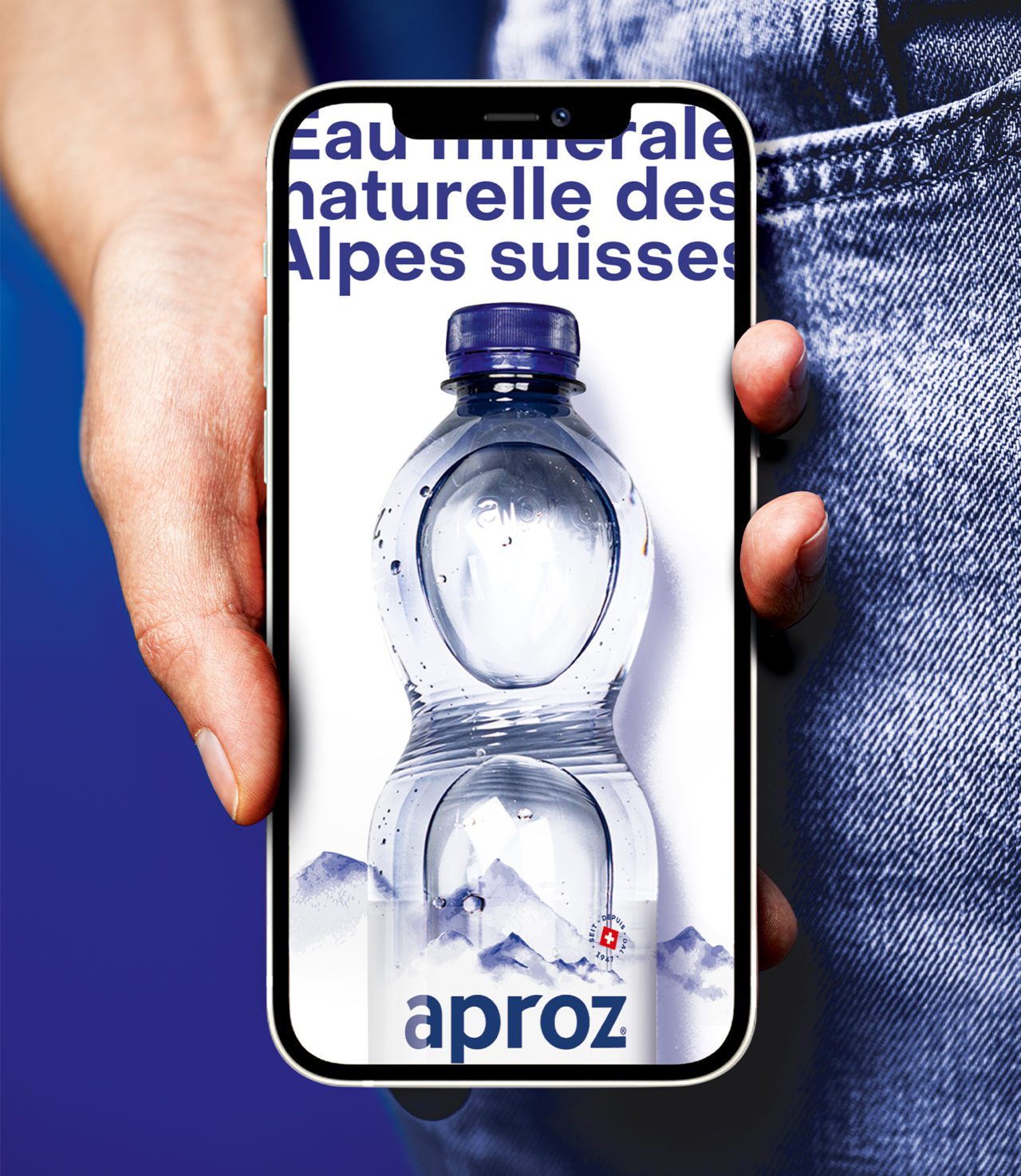
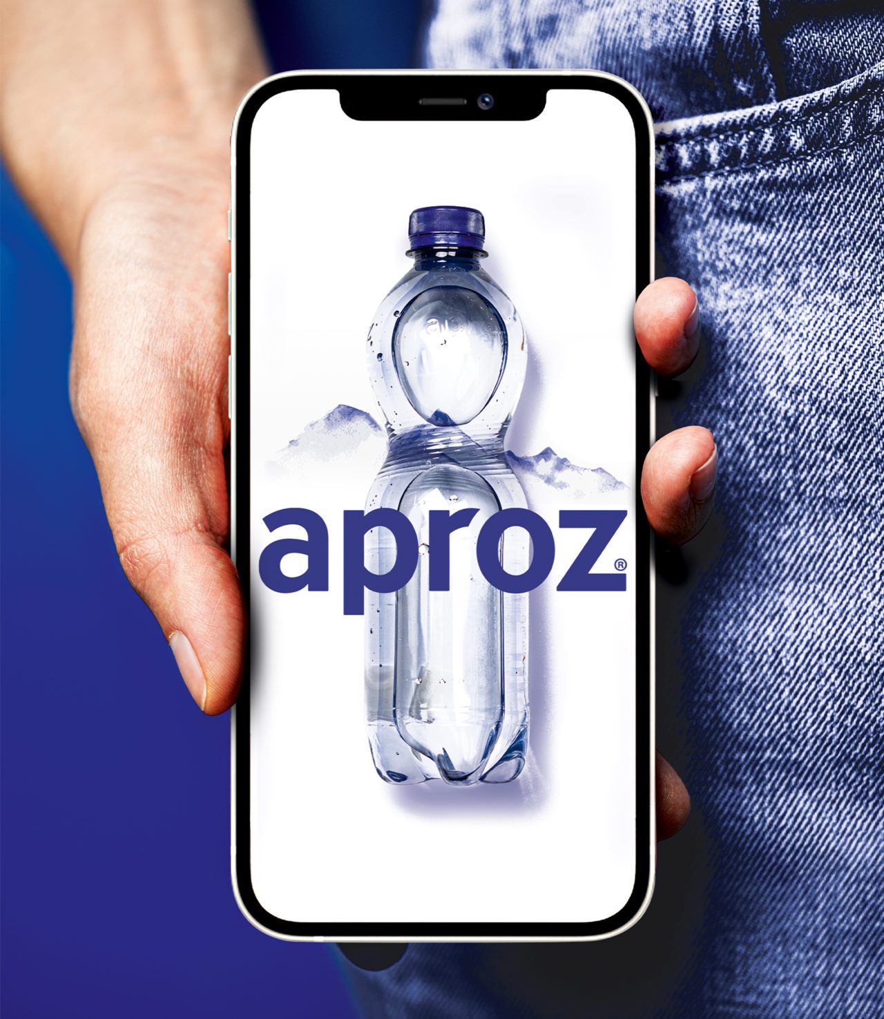
The characteristic type face, the ownable blue, the iconic mountain shape – all these new visual assets have been the pilars of a variety of communication elements.
Consumers love it
Great test results for the rejuvenated Brand predict a successful future. Consumer tests (Innofact, Zürich, 2024) showed the new design outperforming the former packaging in terms of overall appreciation. Respondents also said it gained uniqueness by + 5%.


