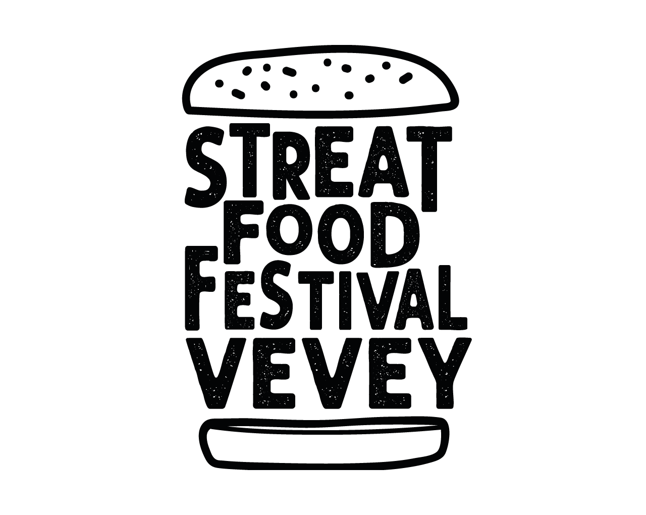
For starters: the branding
We were commissioned to create a complete brand identity for a street food festival. Since it takes place in two cities, we aimed at creating a dual-color system, and a modular logo to let each city have its own twist. One street food festival is good, but two “Streat Food Festivals” are simply better.
One festival, two cities
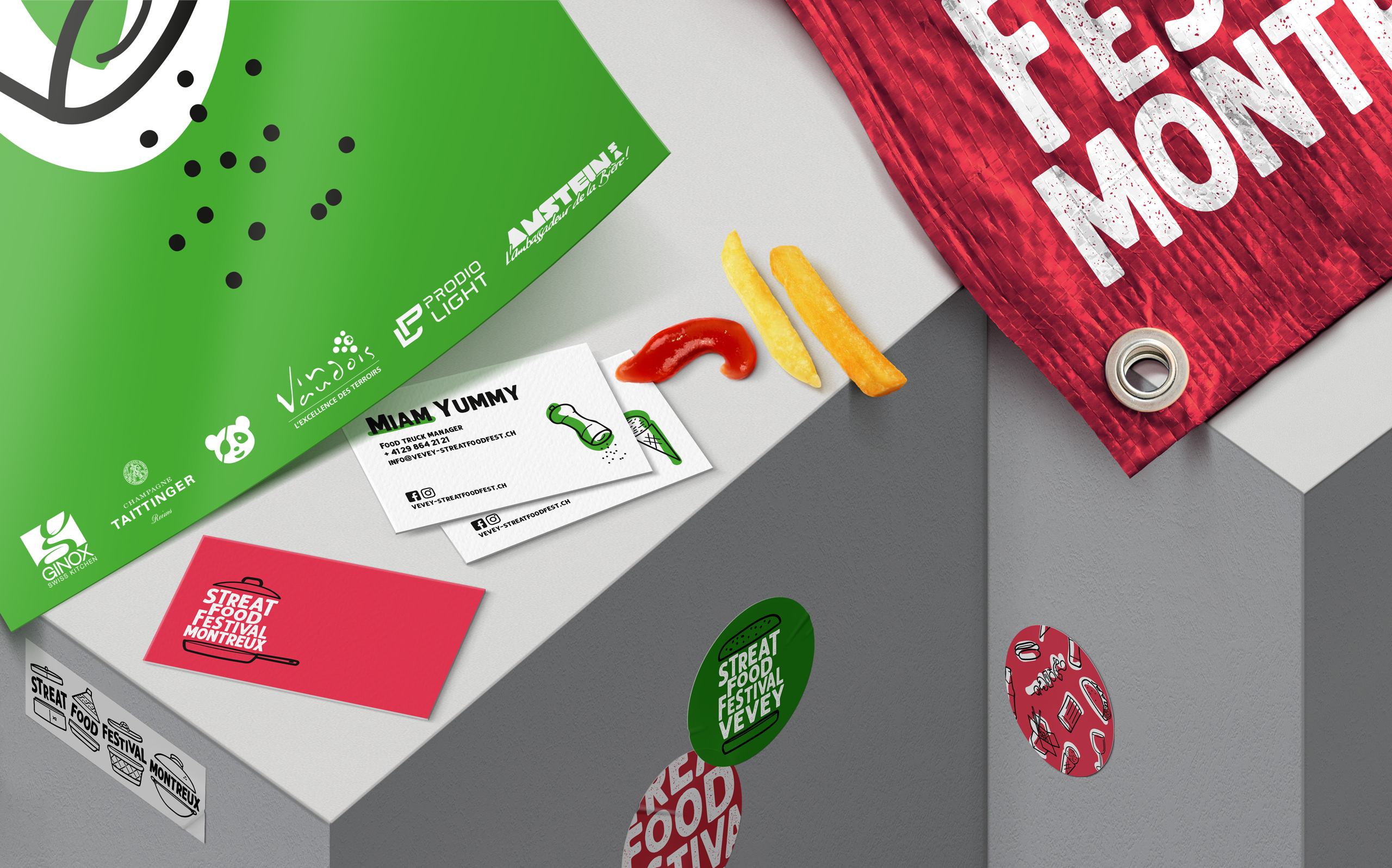
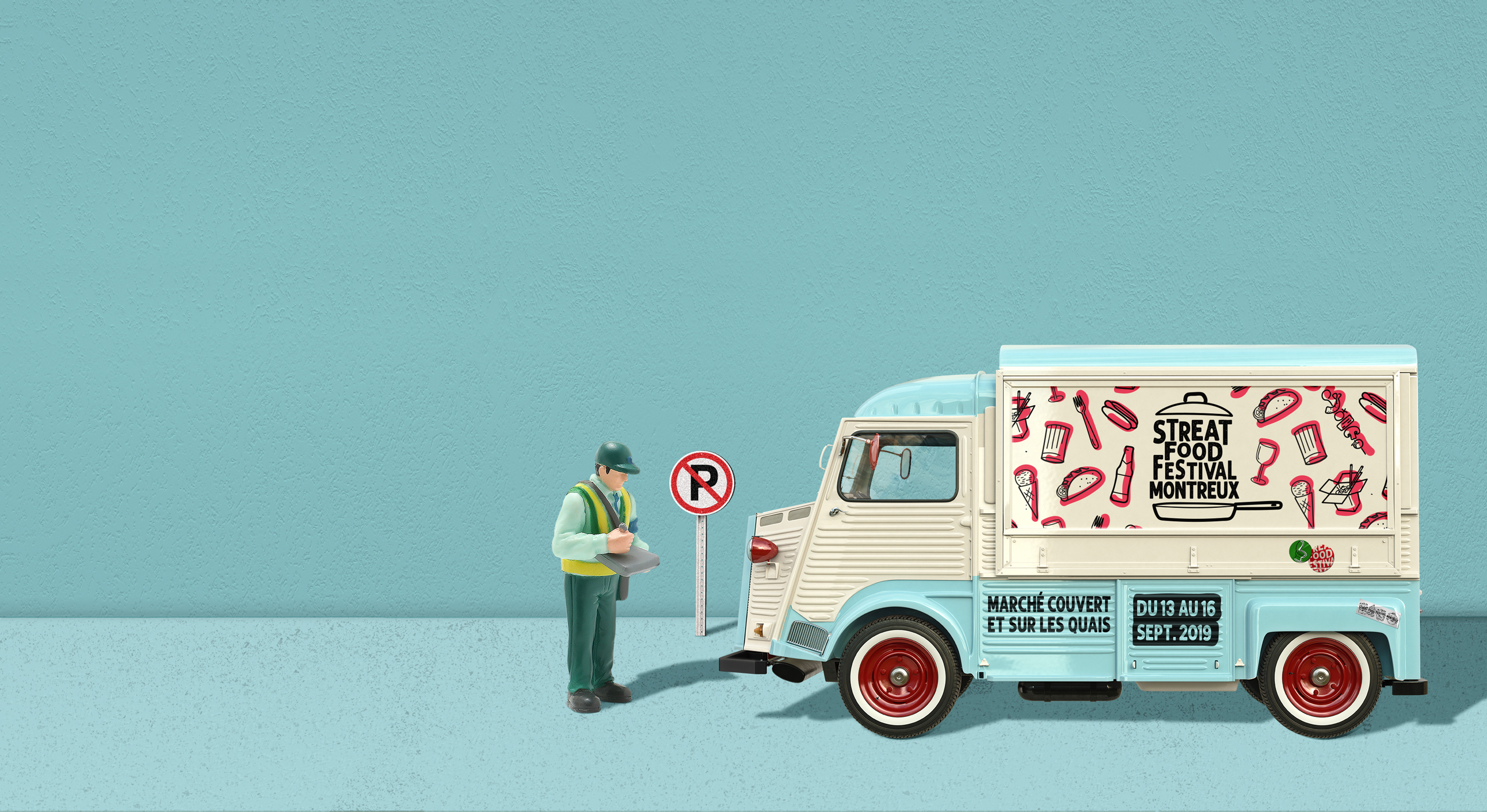
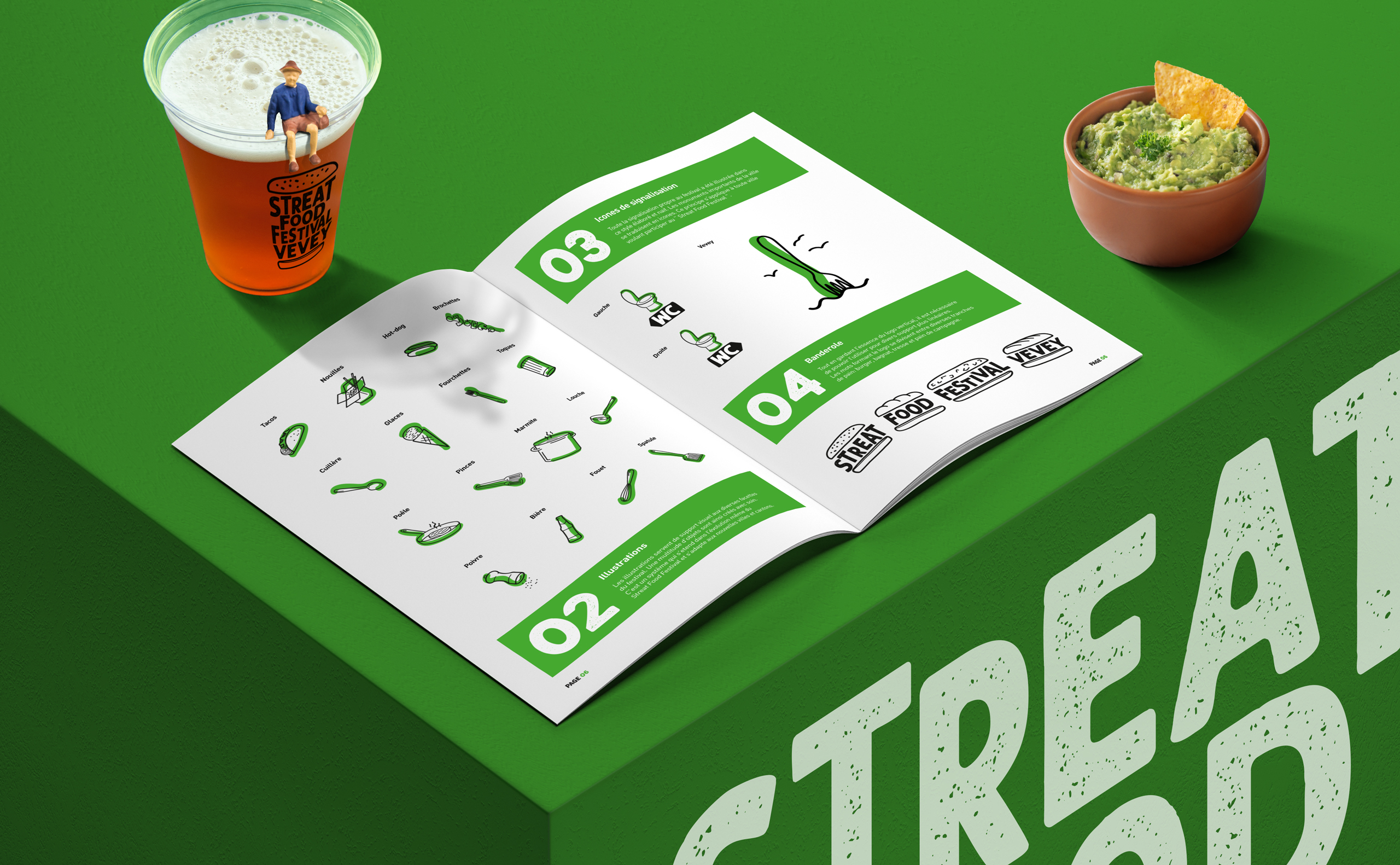
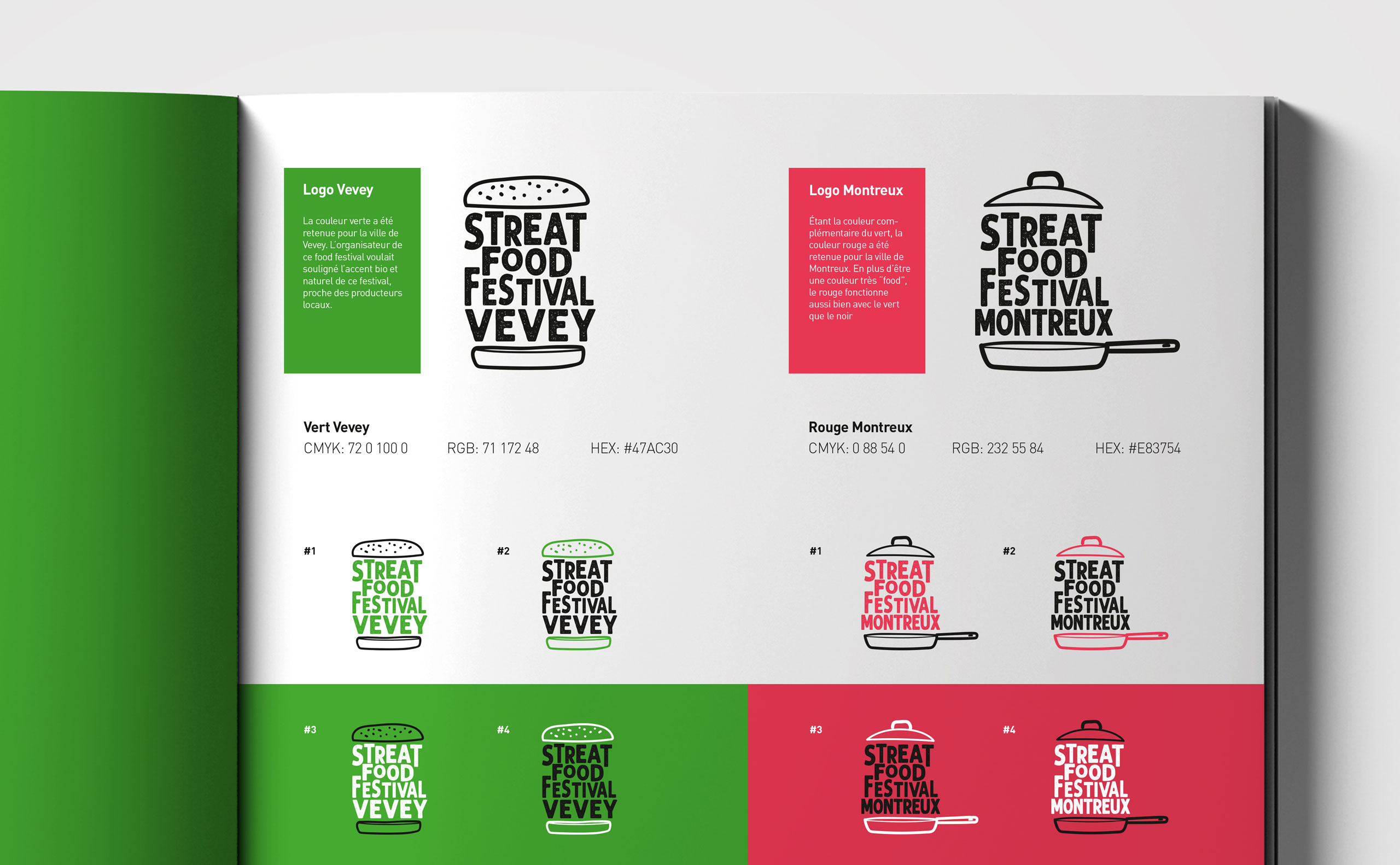
Each city has its logo, yet with a common typographical base. The wordmarks are encapsulated between two burger buns or a cooking pan. This logo system opens the door for various editions. We designed a unique set of icons and illustrations that would reflect the spirit of this festival while being flexible enough to match two different cities.
Designed in and for Vevey
A warm grass green was selected to colorize Vevey’s event. It reflects the local and organic accents of this festival, as well as being close to the producers. The design itself is urban yet accessible to all generations, therefore in line with the festival’s spirit.
Streating in Montreux
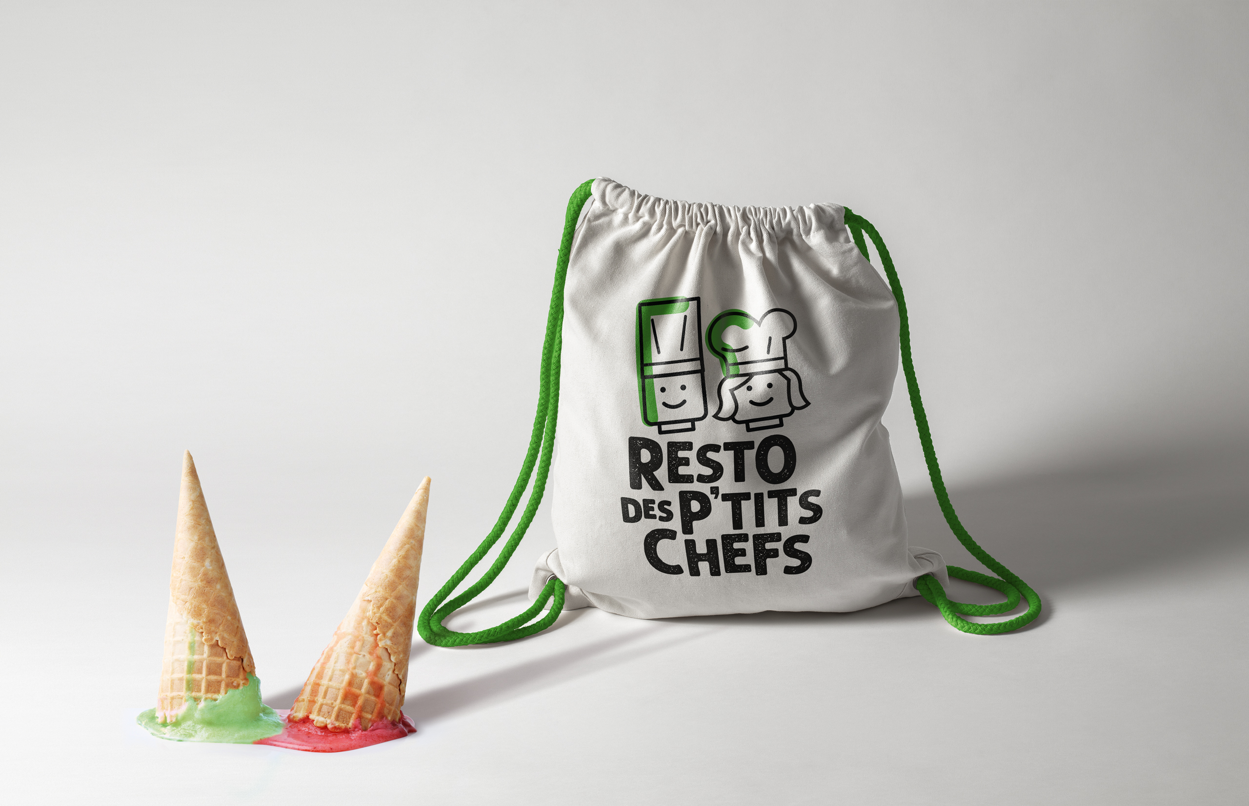
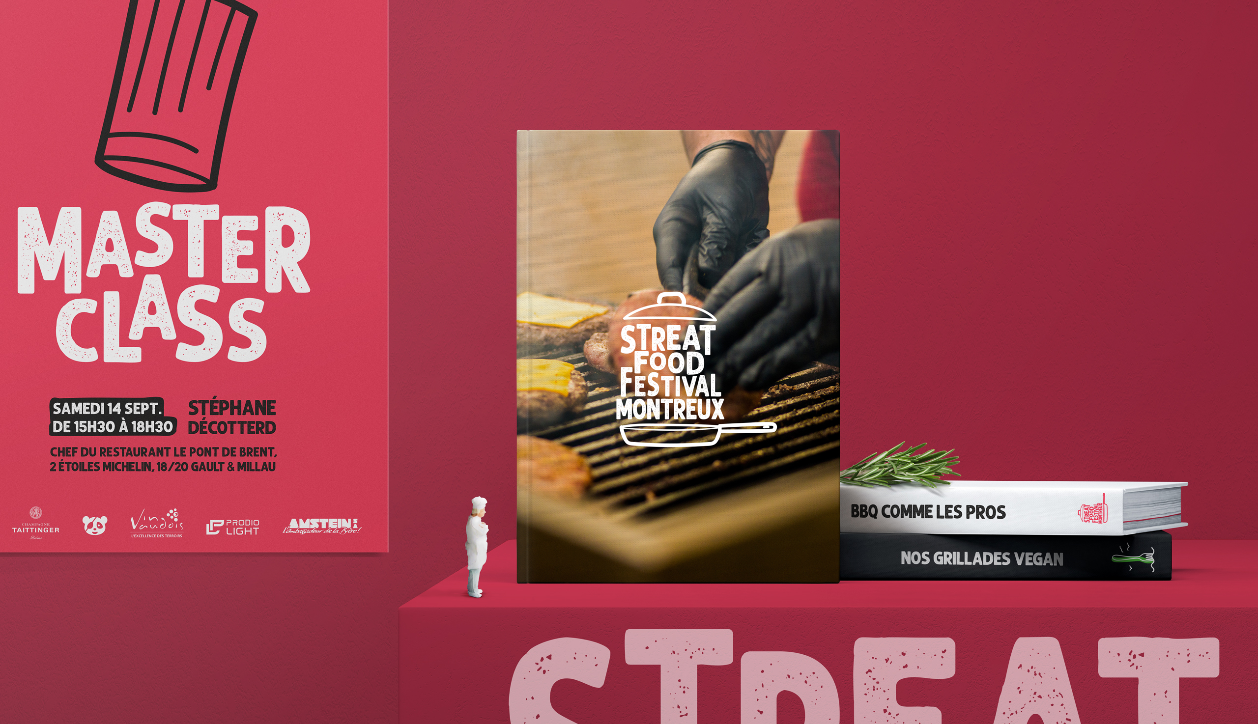
To drift away from Vevey’s identity, we brewed a deep “foody” red. Our designers created various icons for the festival’s numerous workshops such as the “Master Class”, where visitors get the opportunity to learn from the very best chefs around and enjoy their creations.






A medium-rare tone of voice
While creating a recipe for a highly flexible brand identity, we applied it to various items with the same originality. We wanted the festival’s message to resonate with the participants. By using a local lingo and familiar taglines, we aimed at setting a welcoming atmosphere. Popular and modern, the tone of voice benefits from this “street” vibe.
