Branding the cultural field
We were tasked to do a 360° branding of Nyon’s famous documentary cinema festival, from logotype to identity, as well as the whole visual deployment.
An impactful visual identity
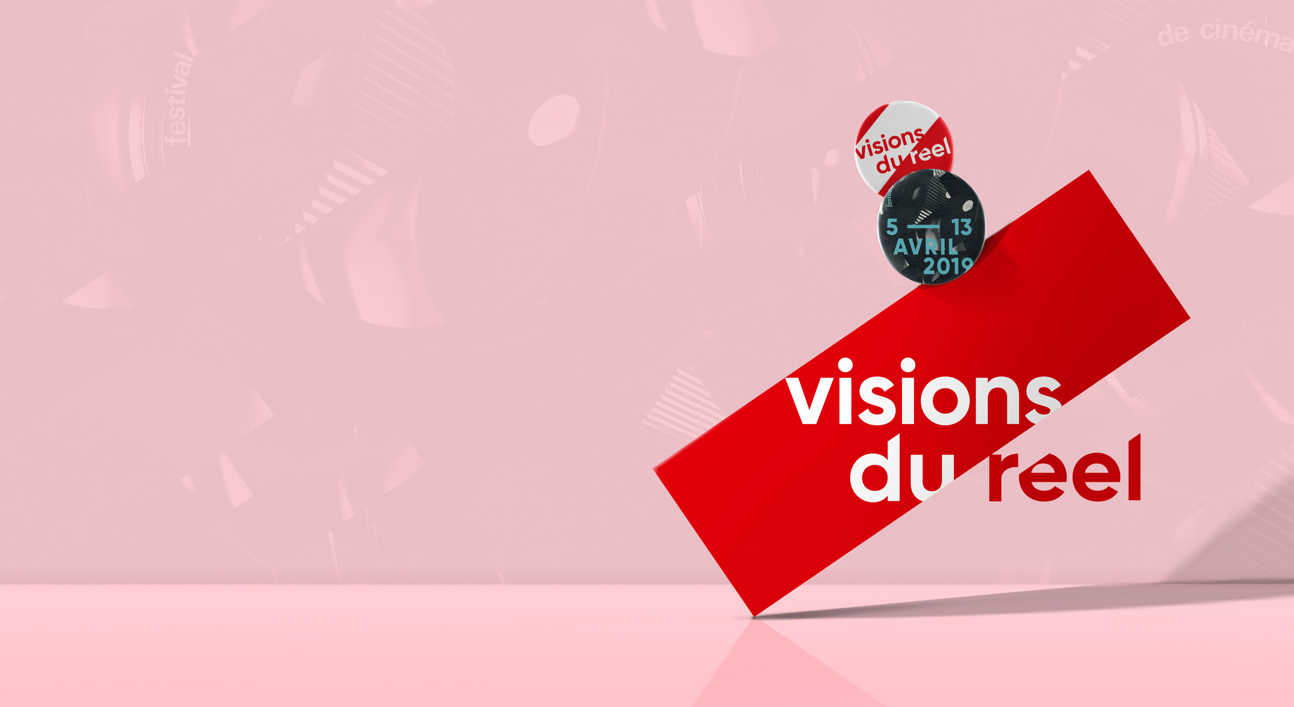
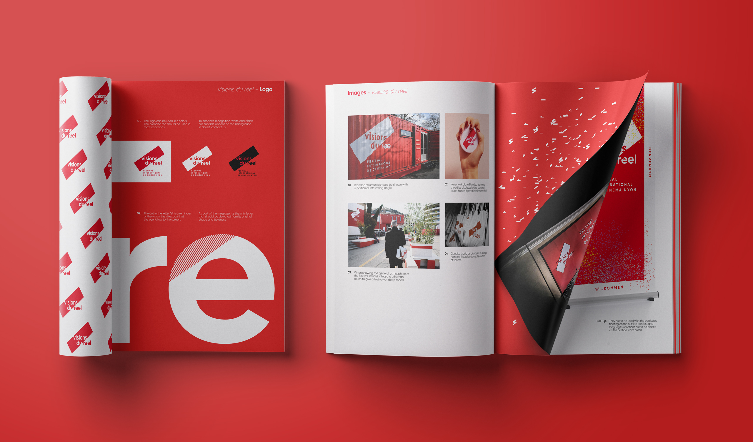
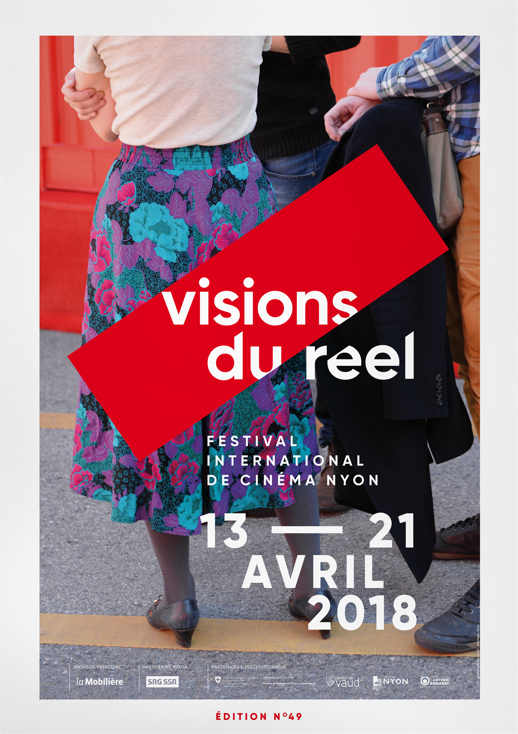
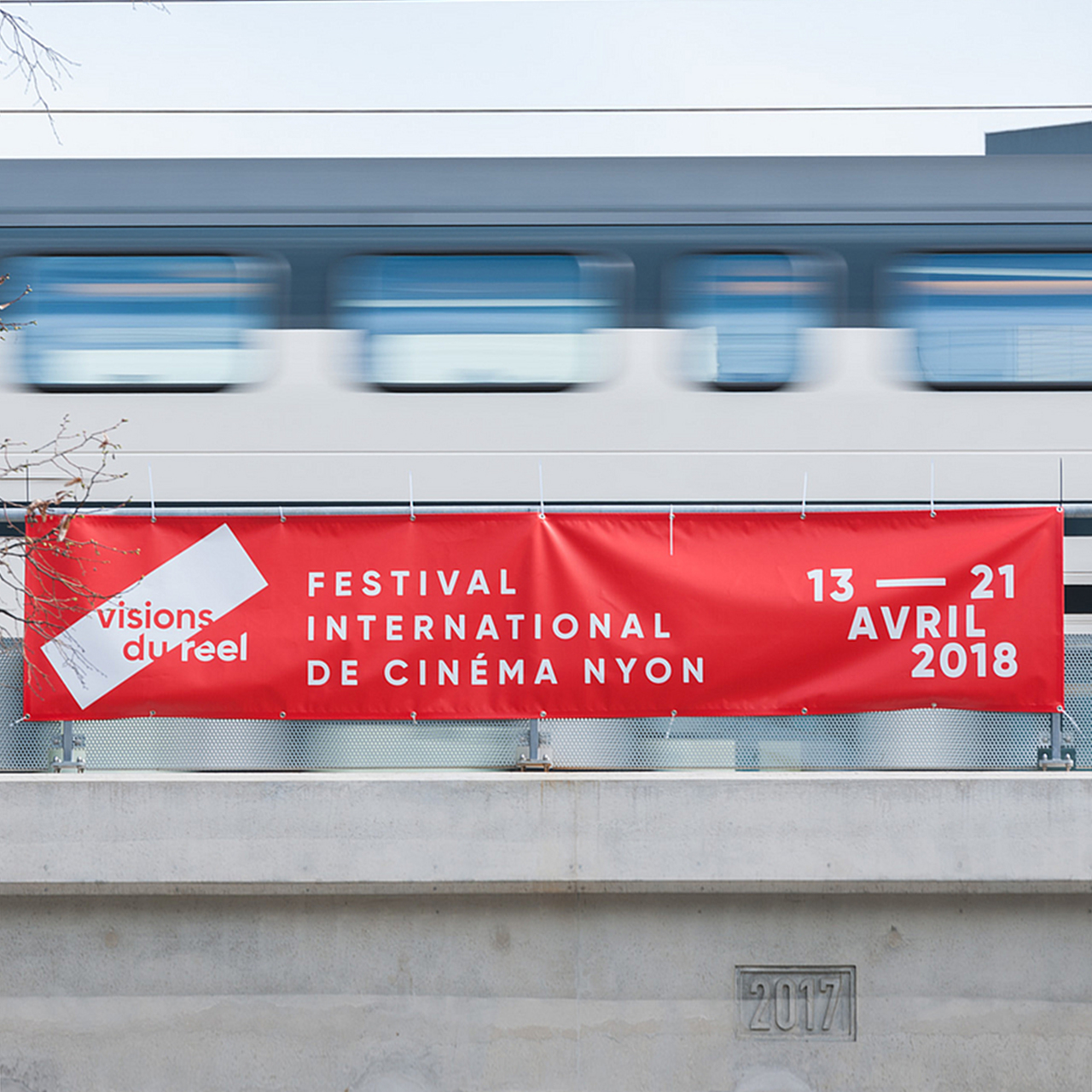
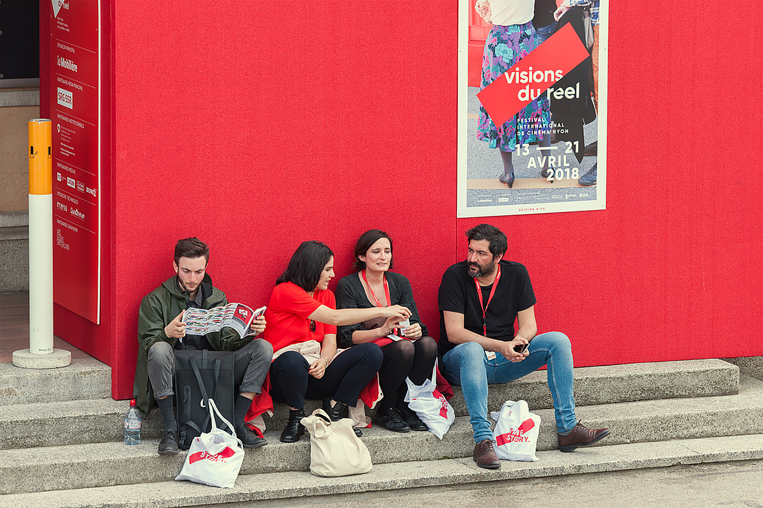
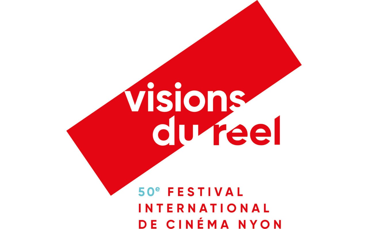
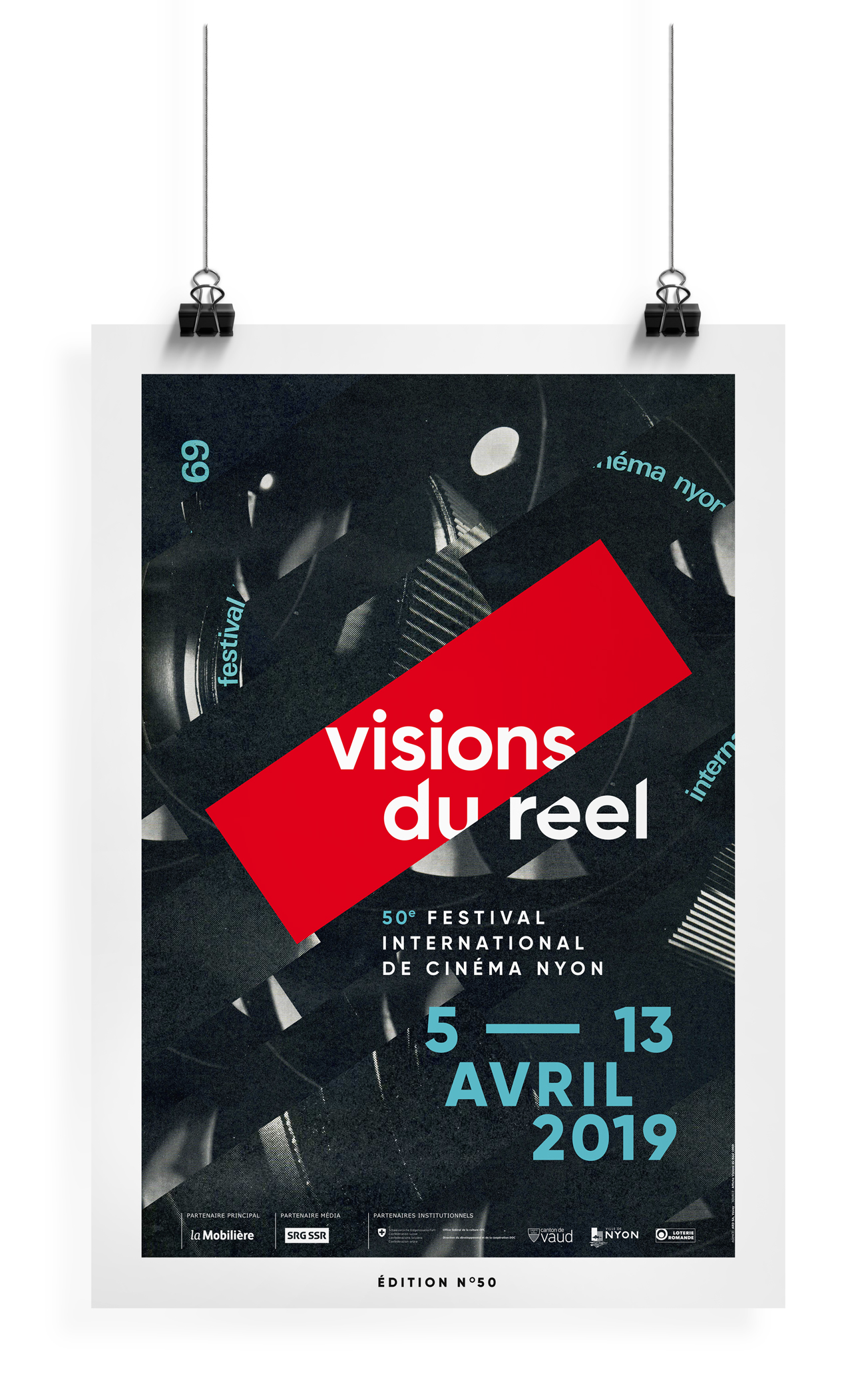
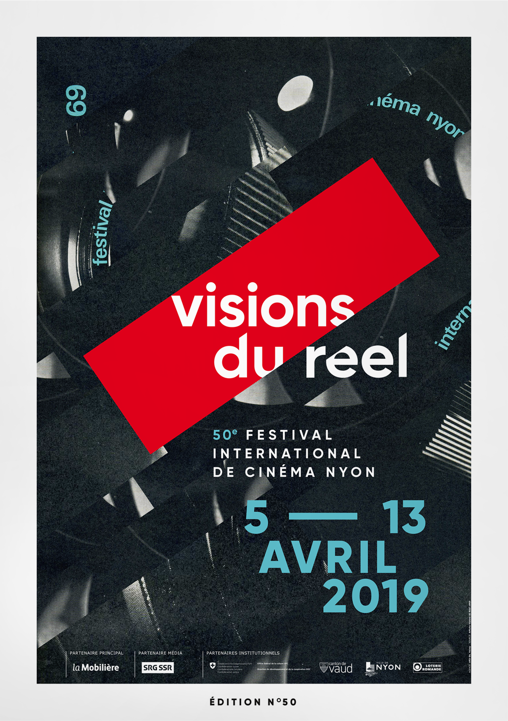
The logo itself challenges the audience’s perception of reality with multiple levels of reading. We improved the impact of the identity with a red rectangle. Inspired by cinema’s screen and the festival’s containers, it focuses the eye on the first two words, while also being the accent of the word “réel”, French for reality.



Branding with a twist
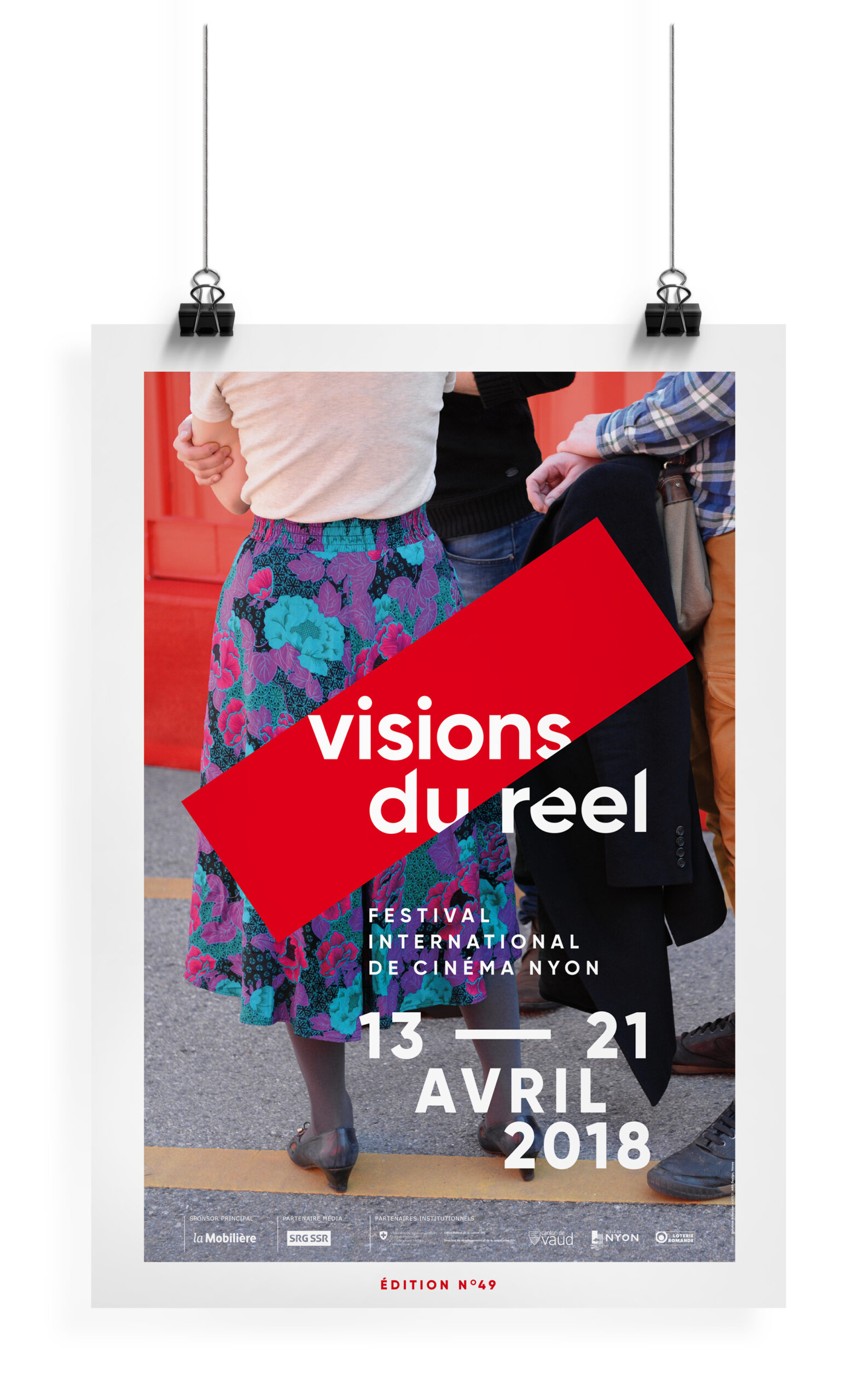
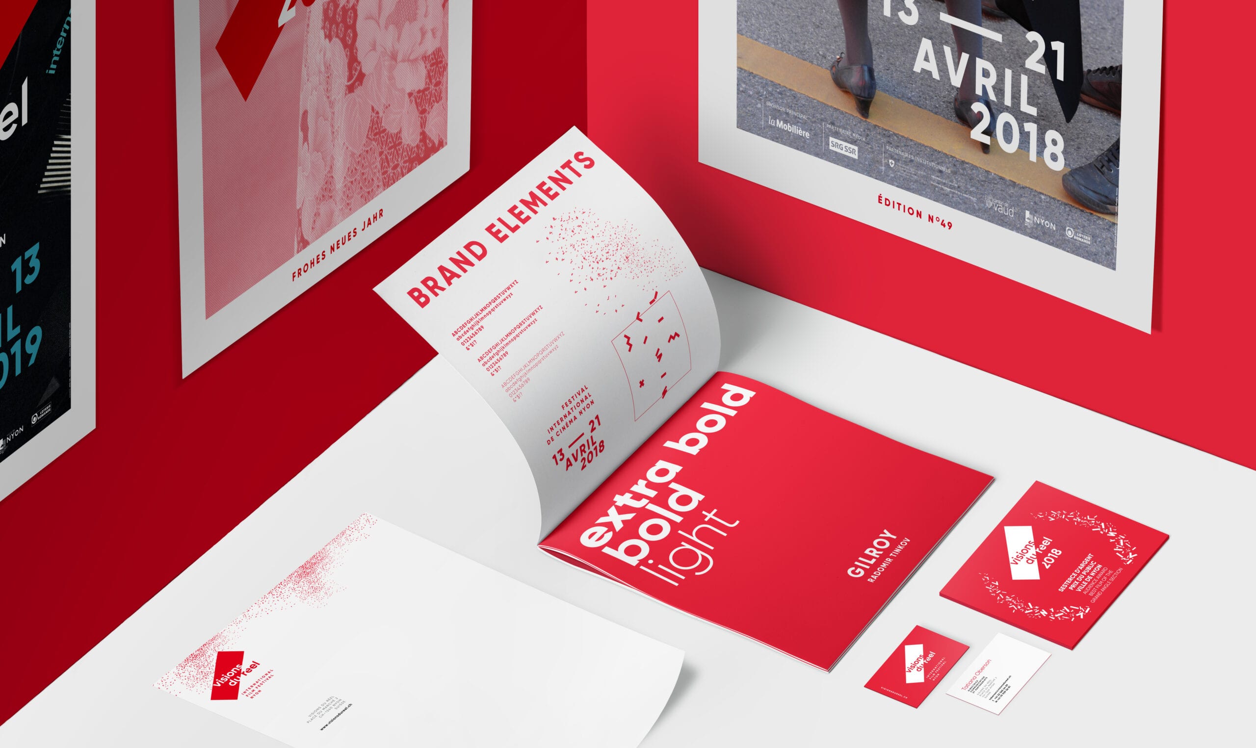
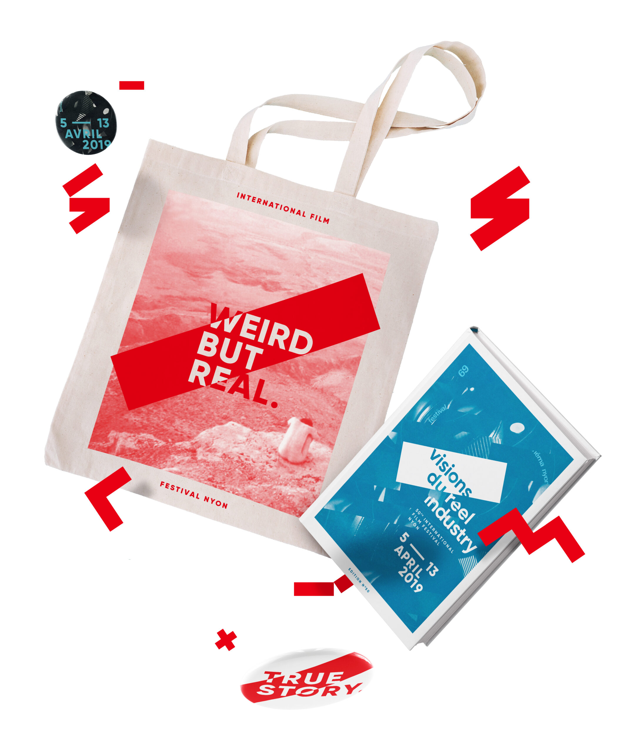
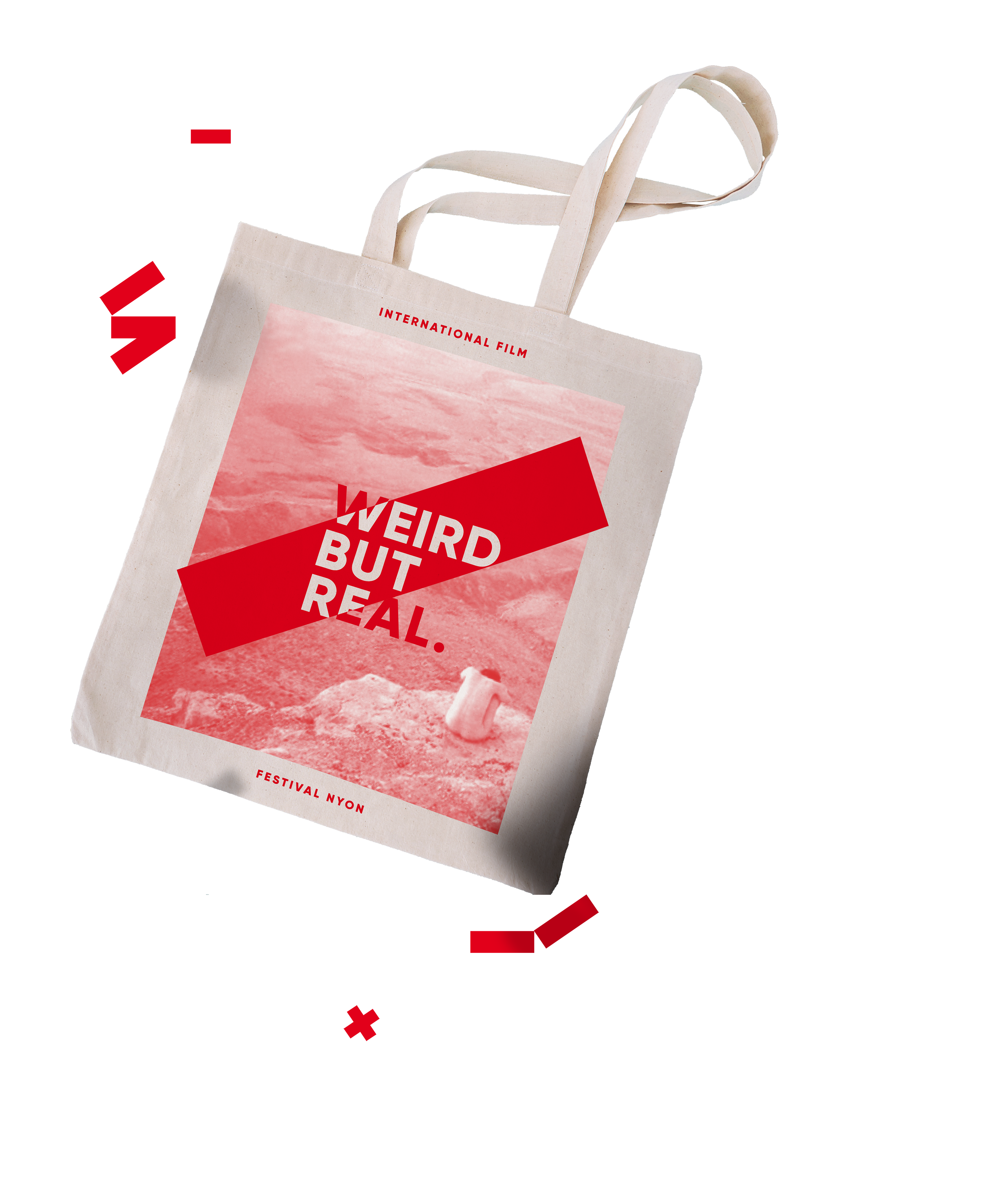
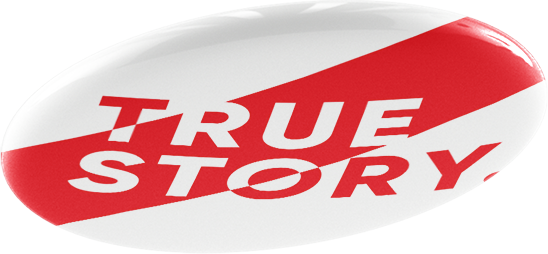
With its high flexibility, the brand identity allows us to express various messages and yet let enough space to truly empower the movies themselves.
50th birthday
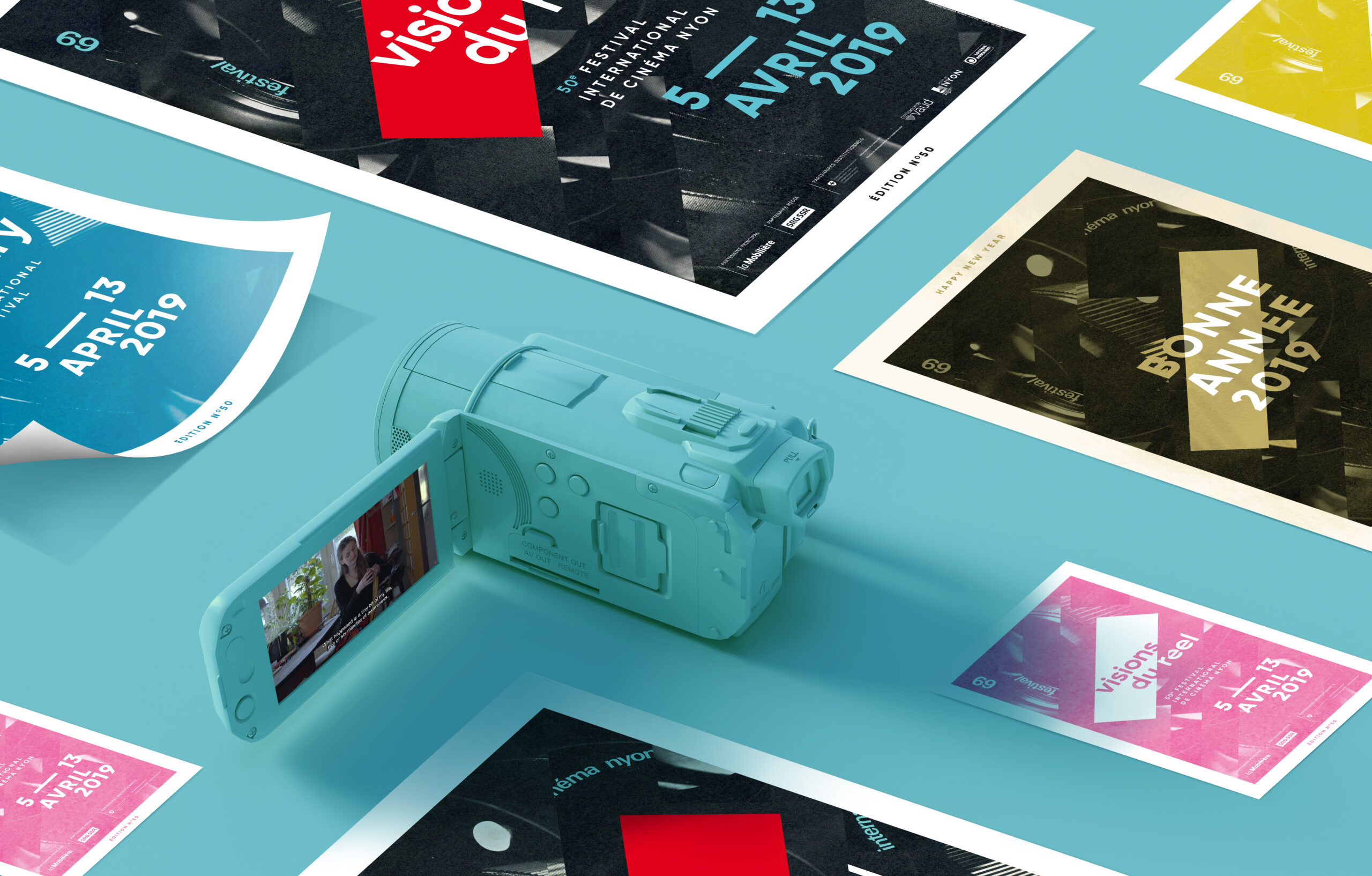
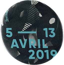
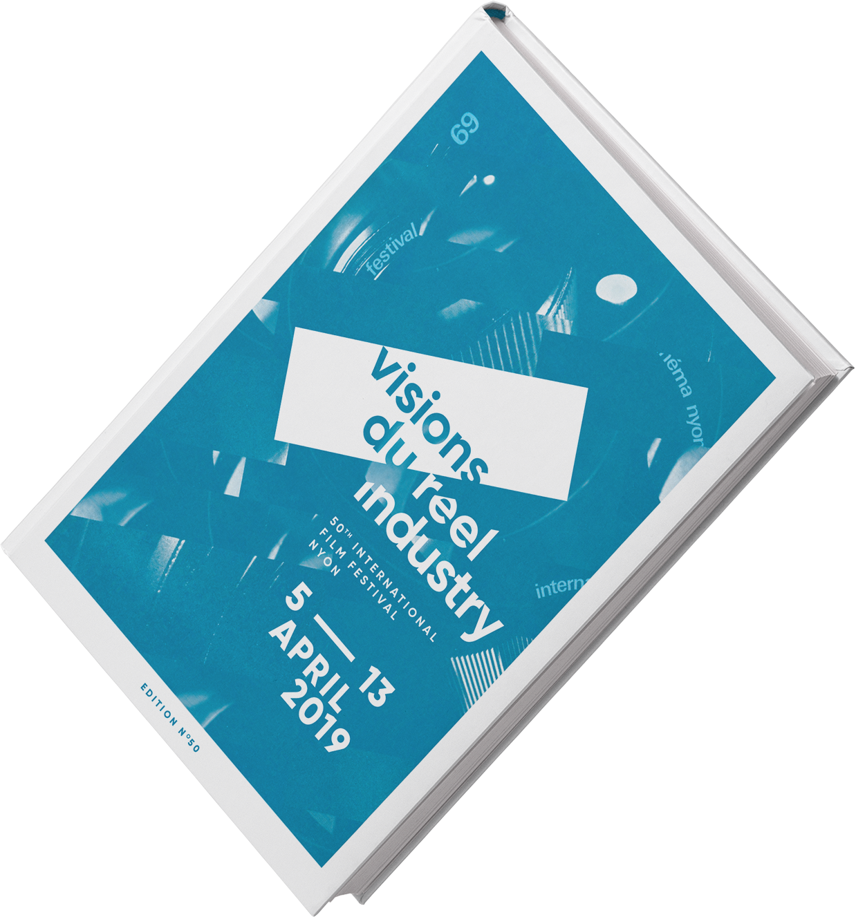
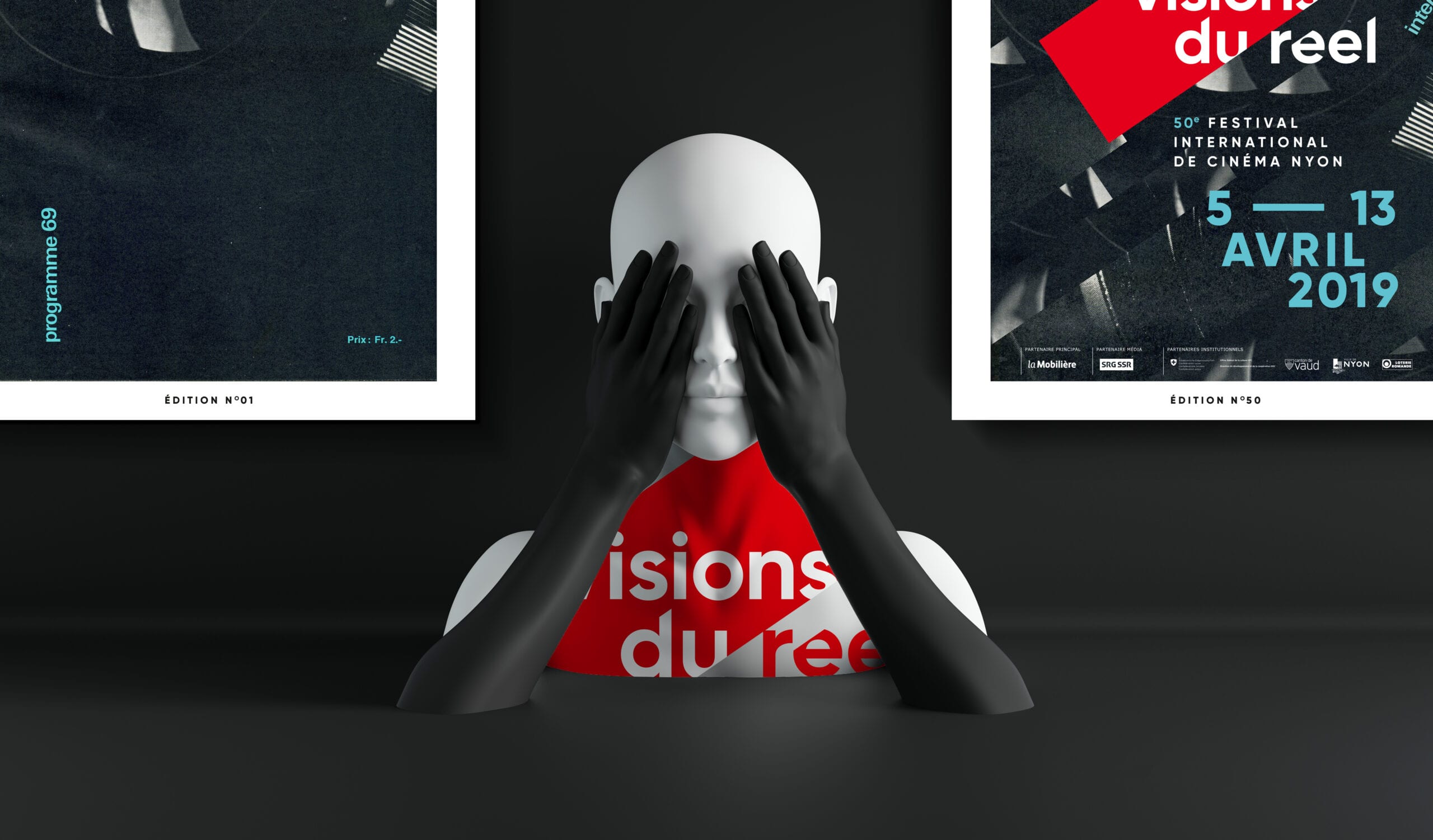
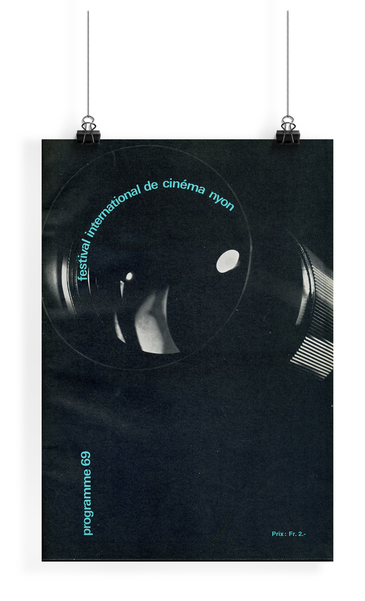
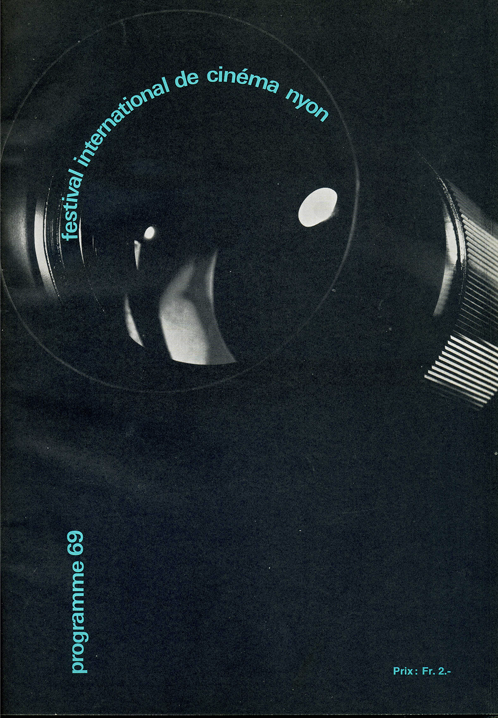
In 2019, we were mandated to design the 50th edition poster, to adapt the visuals for this special occasion and to handle the brand’s application. To strengthen the transition, we kept the blue color from the original 1969 poster.
Cruising in time
We took inspiration from the 1969 original poster, right at the festival’s birth. We restructured the camera lens into fragments, symbolizing the many stories brought up during the festival and the great diversity of perspectives it is known for.




Zoomed-in focus on information
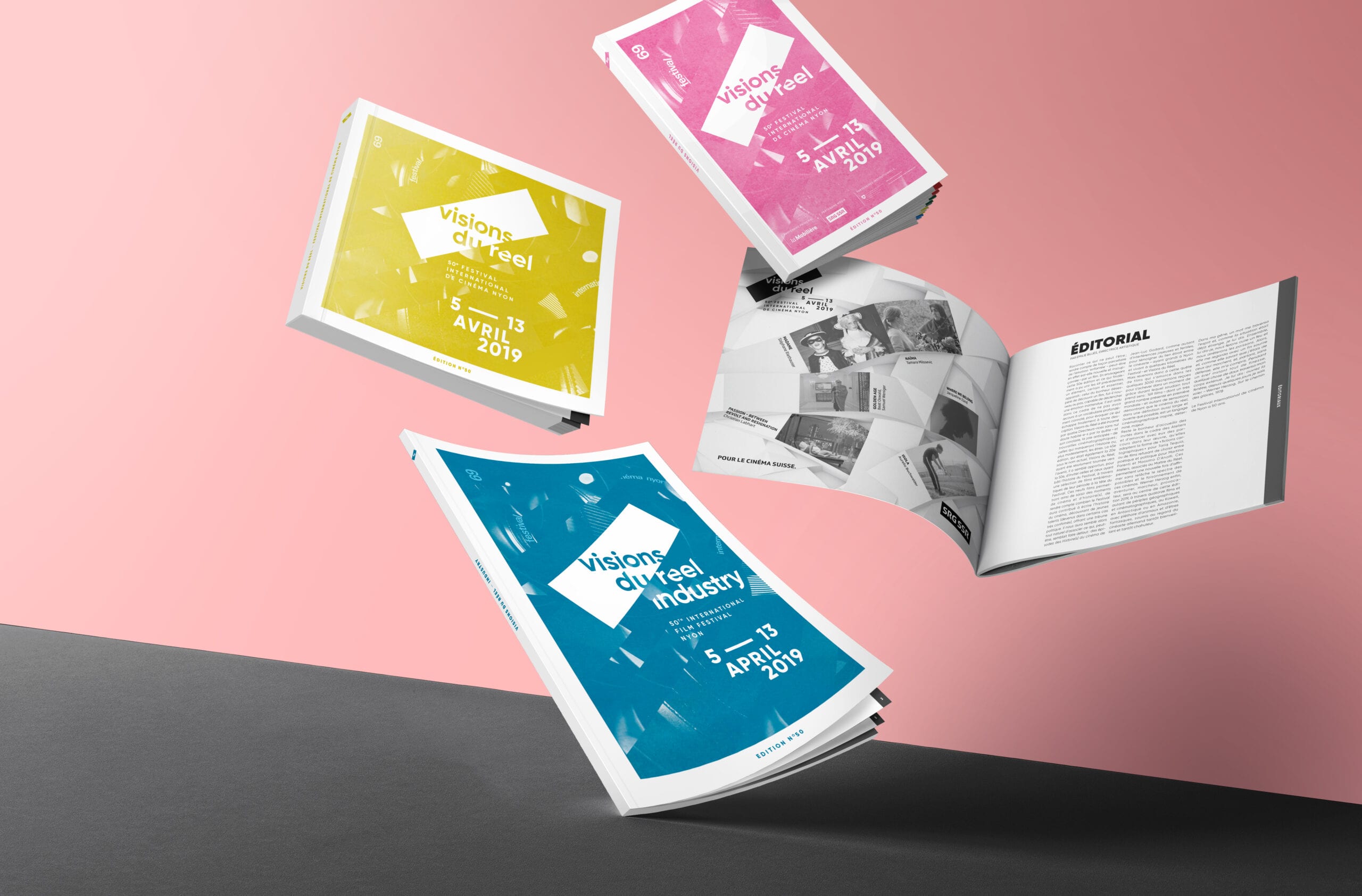
Adapting the format of every printed material to match its purpose, we designed all the needed supports, from the schedule to the festival guidebook, handling a large amount of information. Our aim was to find a cost-efficient design, using only one color integrated with black & white except for the programme booklet.
Cinema, a matter of emotion
Matching down-to-earth needs with creative solutions, we delivered a unique visual identity, simple yet layered with details. Efficient and original, the visual identity of the 50th edition remains true to the values of the original 1969 edition.
