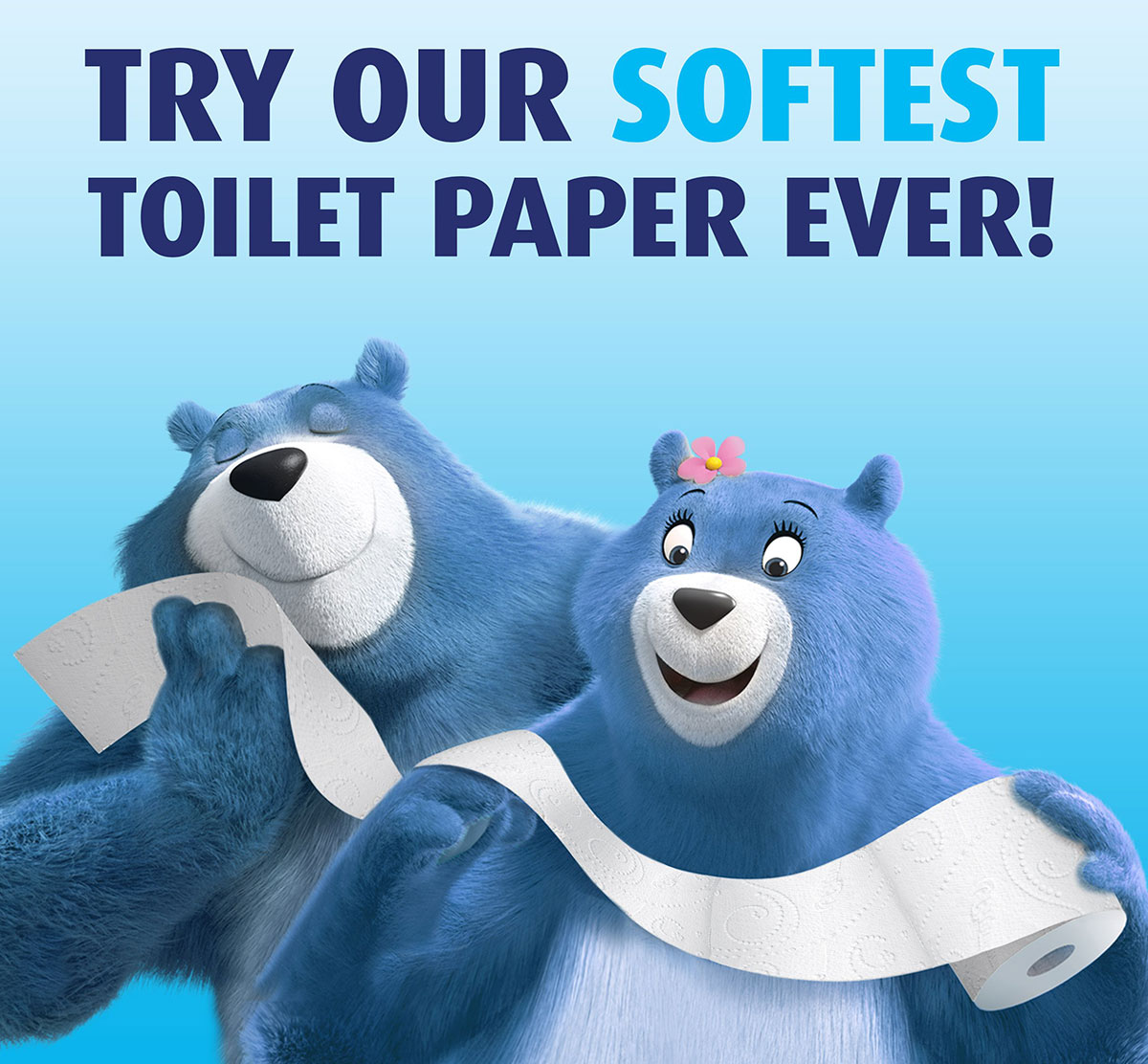
Take toilet paper. Not exactly the kind of product you want the packaging design to expand too much on what it does, the last thing you need is shoppers walking away from your brand by fear of being embarrassed. Here the packaging artwork shouldn’t go too big on representing product functionality but rather focuses on its attributes – a discreet “soft, double-layered sheets” claim next to a big fluffy bear is enough to convey the essential.
A lot of what makes a packaging design good is its ability to communicate on the functionality of the product that’s inside. One tactic is to place a visual of the product when in use – think sporting goods –, another is to show what the product allows the buyer to do – think color pencils. But there are also times when the best tactic is to diffuse attention away from the product.


